Role
Sole Designer
illustration → UX
illustration → UX
Digidentity verified people's identities through ReadID, a third-party NFC SDK we didn't control. I designed the in-house replacement end to end, from illustration and animation to the full UI and UX, so the company could finally own the most critical moment in its product: proving you are who you say you are.
Context: Digidentity is an eIDAS Qualified Trust Service Provider on the EU Trusted List, whose platform has created 25M+ verified identities across 180+ nationalities.
Identity verification — the single most important action in our product — was outsourced to ReadID, a third-party NFC SDK. We couldn't shape the experience, the branding, or the cost. Bringing it in-house meant ownership, but NFC scanning is genuinely hard for ordinary people: most users don't know what an MRZ is, where the NFC chip sits inside their document, or how to hold the phone steady long enough to read it.
And every failed first attempt turns into a support ticket, so the experience design wasn't a nice-to-have, it was the difference between a verification that completes and one that lands on the service desk.
EU citizens verifying a government-issued document — passport, national ID card, or driving licence — on their own phones, across iOS and Android. Largely non-technical, operating across eight languages, and often doing this for the first time under a little pressure.
I owned every design layer, from illustration to production UI. Several of the biggest calls in Phase 1 were not mine, and the story is clearer for saying so.
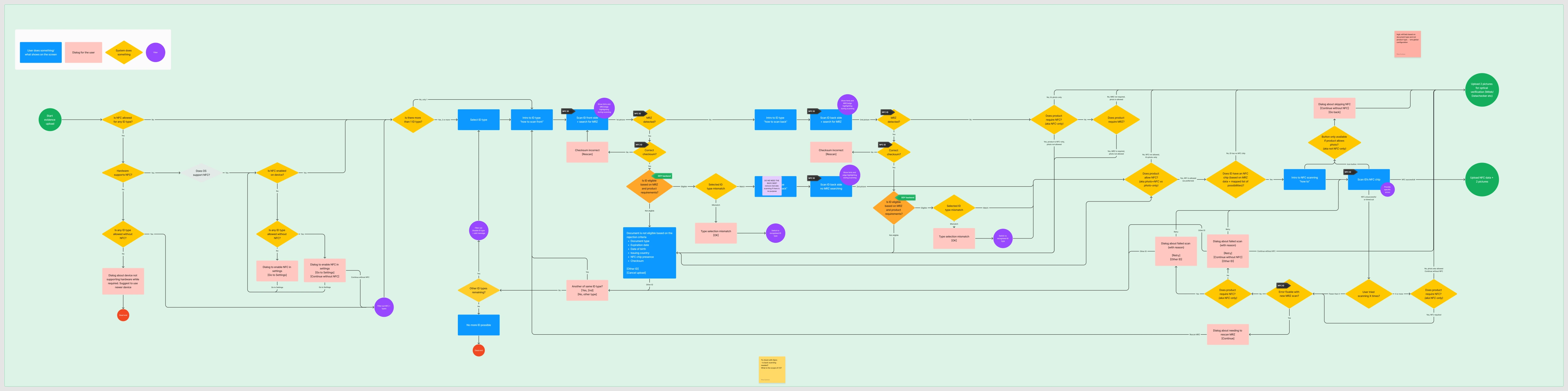
An NFC read can't happen until the app has the document's key data. There are only two ways to get it: make the user type it (more steps, more errors) or scan the machine-readable zone to capture it automatically. I mapped both and argued for the second: MRZ pre-validation, to collapse the steps and take decisions off the user's plate.
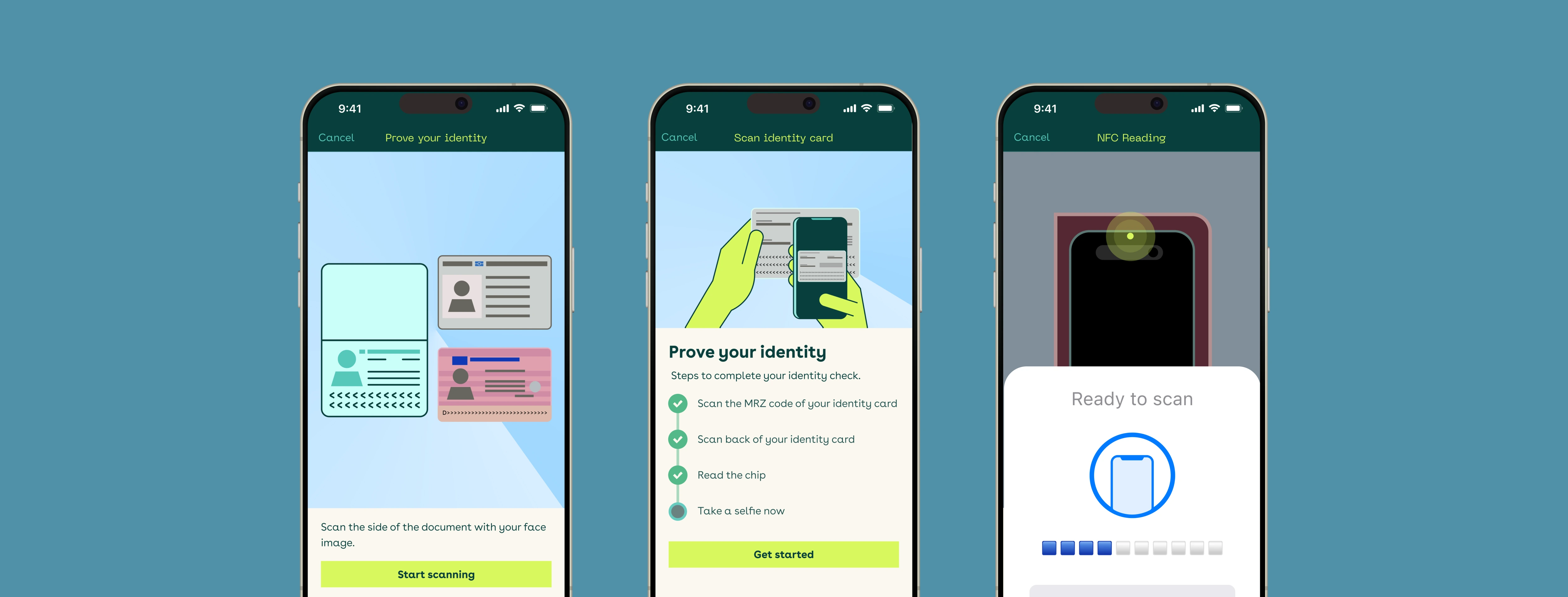
Passport, ID card and driving licence each got their own positioning guidance, scan sequence, and success / error states, unified under a single, consistent pattern so the flow felt like one product, not three.
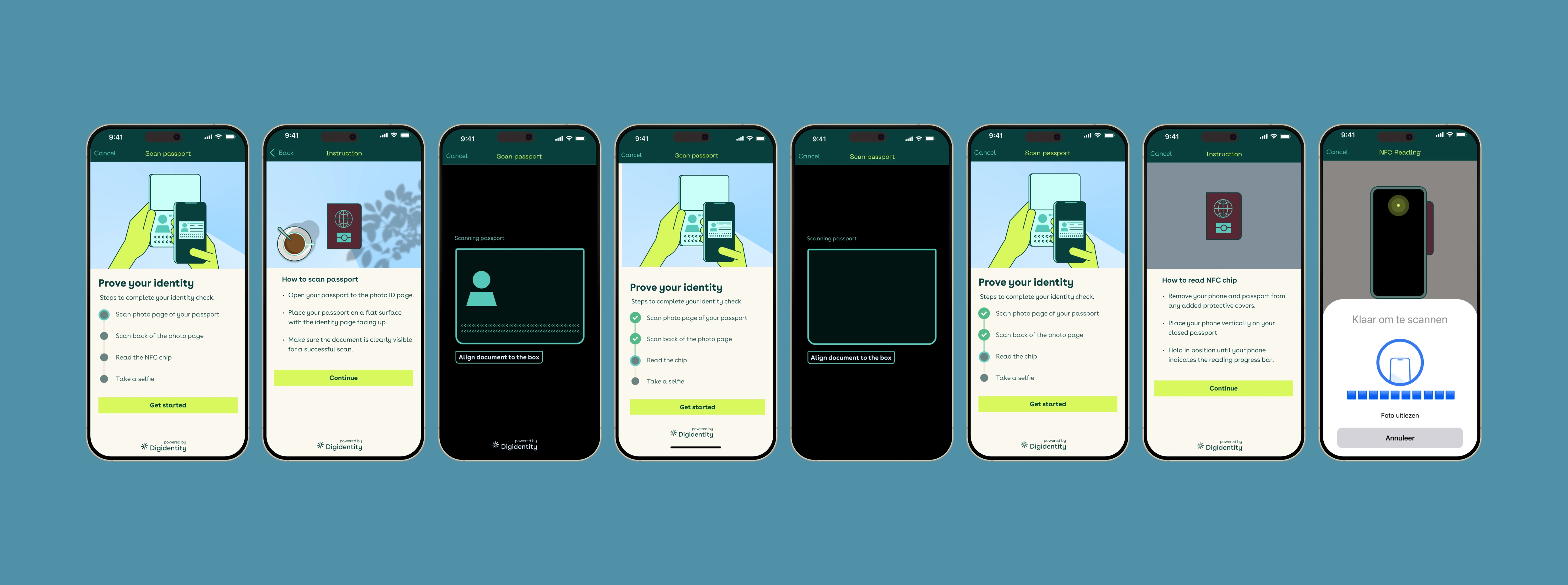
Because users didn't understand the MRZ or chip placement, instruction became a craft in its own right. I designed and illustrated animated guidance showing exactly how to position the phone against each document type, the hand-holding ReadID never offered.
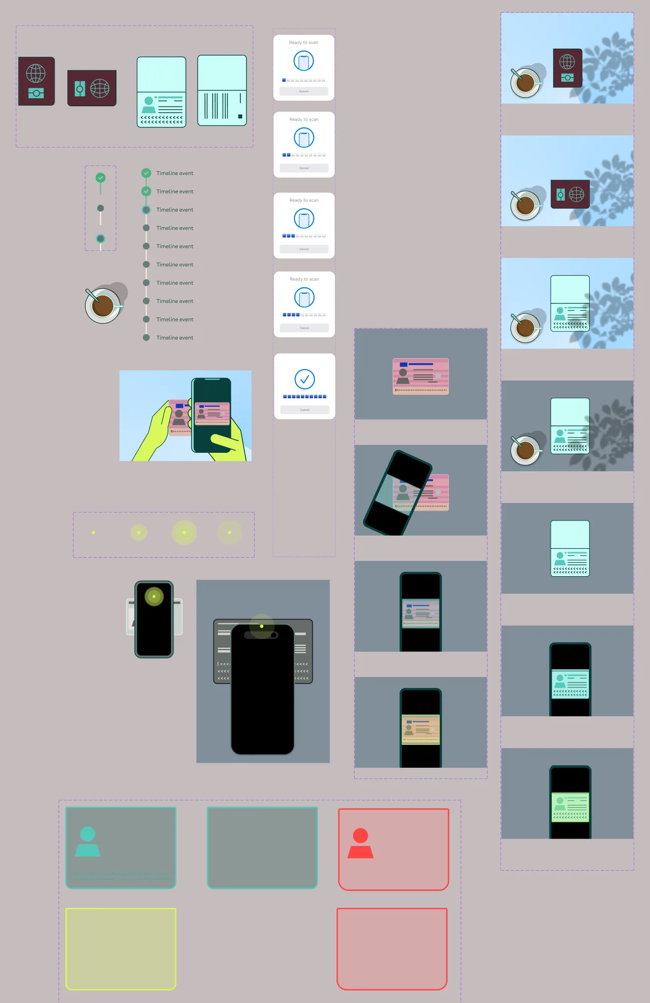
The guidance only works if it's built to scale, so I made it as a system, not a set of one-off screens. I illustrated every document — passport, ID card and driving licence — along with the hand-and-phone positioning scenes, all drawn in the Digidentity visual language so the instruction felt native to the product rather than stock.
I then turned the flow's key moments into reusable components: the "Ready to scan" progress states, the scan-in-progress steps, and a shared success / error language — a calm teal for success, a clear red for failure — applied consistently across all three documents. Those same states became the animation frames: I storyboarded each scan sequence on this board, then produced the motion from it — Figma → MP4 → HandBrake in Phase 1, rebuilt in Lottie per device in Phase 2.
I advocated for MRZ pre-validation from the start. But technical difficulty and limited capacity led senior stakeholders to overrule it for Phase 1: the directive was to replicate the ReadID steps as faithfully as possible and de-risk the launch. That meant a longer flow and a heavy dependence on instruction.
Replicating ReadID surfaced exactly the friction I'd predicted: without pre-validation, users were left to understand the MRZ and scanning on their own, so the whole flow leaned on instructional animation to carry them through. The pipeline was constrained too. Engineering pushed back hard on Lottie, so I built everything in Figma, screen-recorded to MP4, and compressed the files through HandBrake to keep them shippable. And it was all iPhone-first.
Then in Phase 2, stakeholders asked to cut screens and steps, which led straight back to the MRZ pre-validation flow I'd originally proposed. I'm now reverse-engineering toward it. Engineering also adopted Lottie at last, letting me replace the heavy MP4 workaround with lighter, per-device animations instead of one iPhone-centric set.
MRZ pre-validation deprioritised; the ReadID steps mirrored to de-risk the launch. Heavy instructional animation, built Figma → MP4 → HandBrake, and iPhone-first.
The org circles back to MRZ pre-validation. Screens and user decisions cut, Lottie adopted at last, and animations rebuilt per device: a cleaner, more scalable foundation.
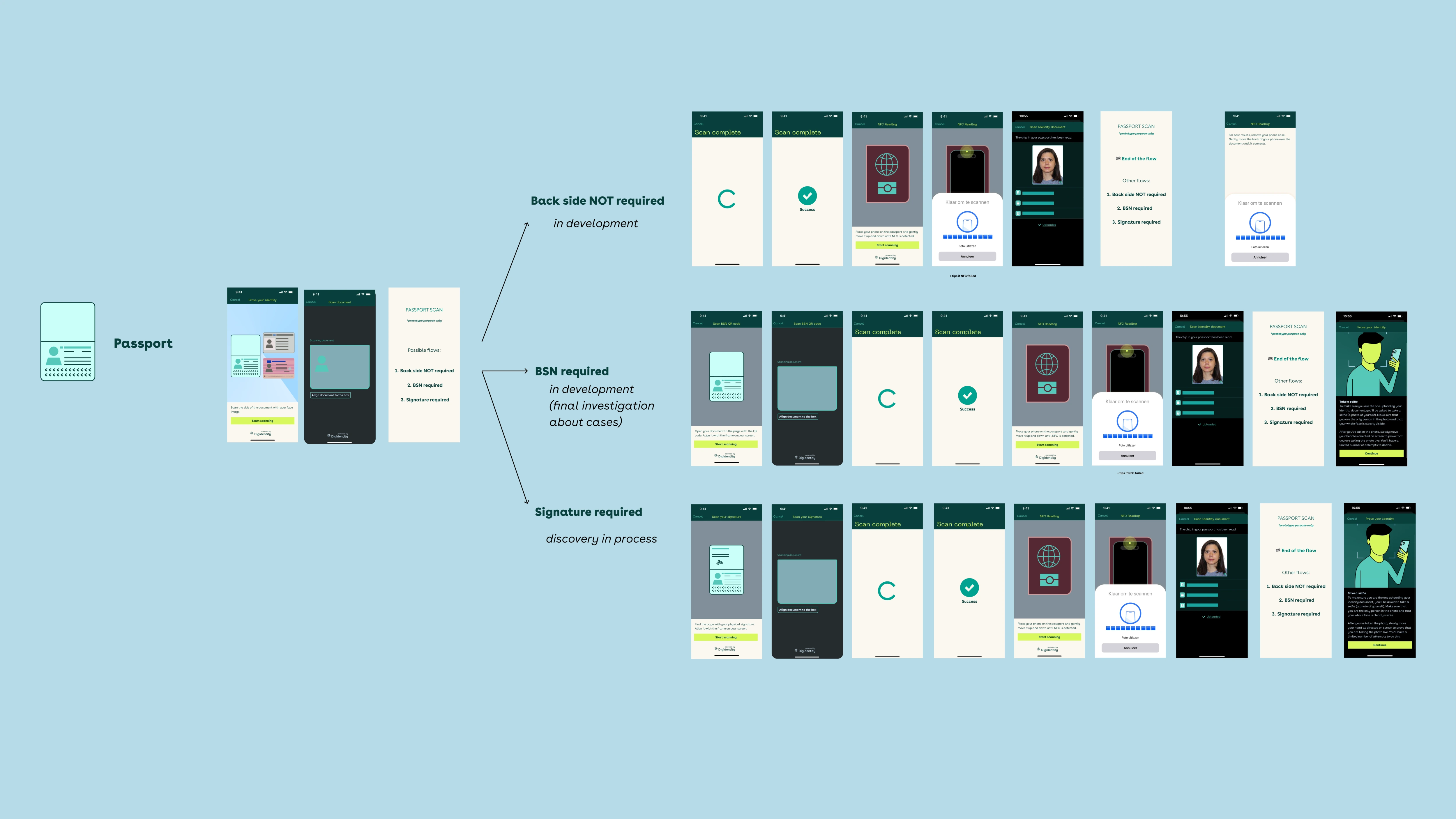
A complete, in-house NFC verification flow for passport, ID card and driving licence (instructional animation for phone positioning, the scan sequence, and clear success / error handling), live on both iOS and Android. I owned every layer, from illustration through to production UI.
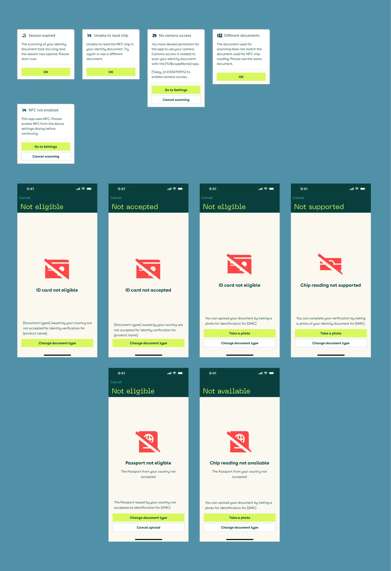
Scans fail for reasons a user can't see: a session times out, the chip won't read, a document isn't eligible in their country, or the device simply doesn't support NFC. I designed the full error and recovery set — system dialogs and full-screen states — so every dead end offered a way forward instead of a shrug: take a photo instead, change document type, or fix the setting that's blocking the scan. Each state names the problem in plain language and hands the user their next move, which is what keeps a failed attempt off the service desk.
I built the flow within the Digidentity design system, keeping the three document journeys and both platforms visually consistent and fully localised across eight languages.
Phase 1 was a study in working within constraints: Figma → MP4 → HandBrake when Lottie wasn't on the table. Phase 2 moves to Lottie with device-specific guidance: a cleaner, more scalable foundation.
Phase 1 shipped: Digidentity now runs its own NFC verification instead of ReadID, owning the experience and removing the third-party dependency, across three document types, two platforms, and eight languages. The redesigned experience cut UI-related errors by 80% and abandonment by 25%.
I track NFC verification health through a live analytics dashboard (Evidence Studio), monitoring session outcomes and failure taxonomy across 210,000+ sessions over the past year. This data-driven view lets me distinguish user-facing UX friction from underlying technical failure modes, informing where design intervention can help versus where the fix sits outside the interface.
With more capacity up front, MRZ pre-validation would have shipped in Phase 1 and saved a redesign loop, and earlier Lottie adoption would have spared the MP4 / HandBrake workaround. The phased reality taught me something I value now: keep a good idea documented and ready, because the constraints that kill it today often lift tomorrow. Post-launch data also showed that strong UX can't fix every platform constraint: upload-size handling and document/country eligibility still caused some scans to fail regardless of instructions. That finding was translated directly into next-iteration technical priorities: file-size validation, clearer upload feedback, and better handling of restricted document cases.