Illustration, brand
& motion work.
Selected client work in illustration, branding, motion and art direction — alongside self-directed product and UX explorations. Pick a project from the index to open it.
PVH — Omnichannel.
Motion & animation
Created the video and animations of PVH-omnichannel, an internal platform similar to Instagram for PVH store staff across the globe.
8 pieces · 8 motion
JUIZS.
Illustration
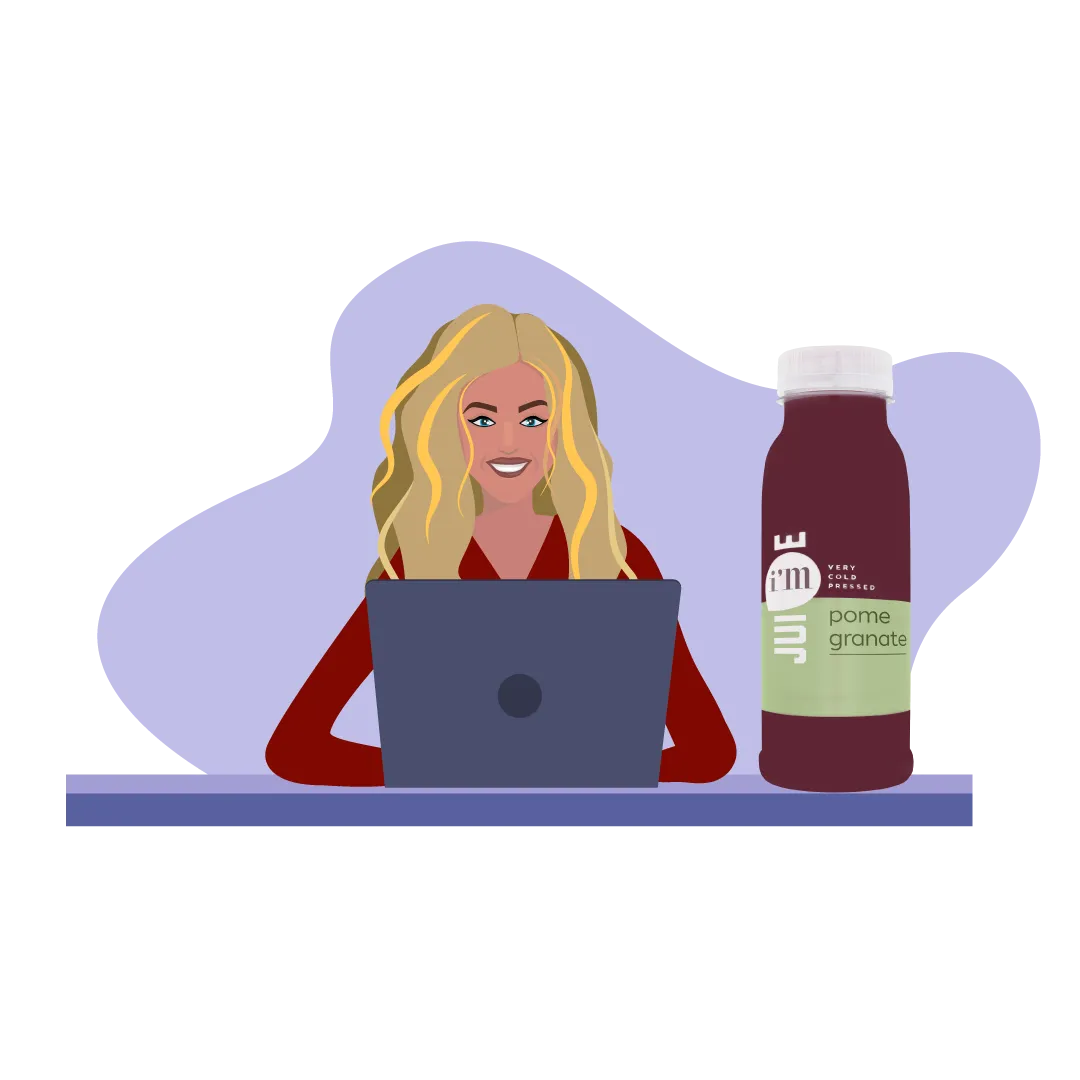
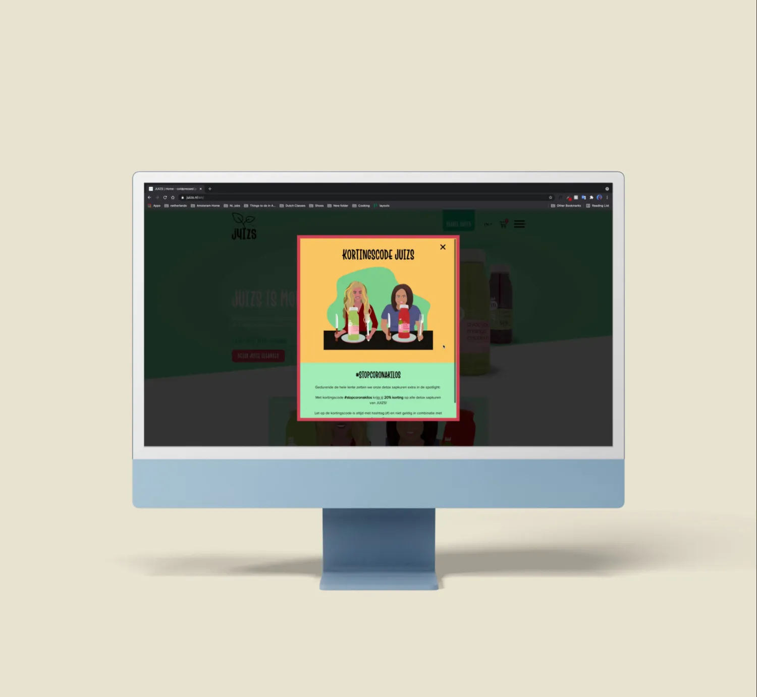
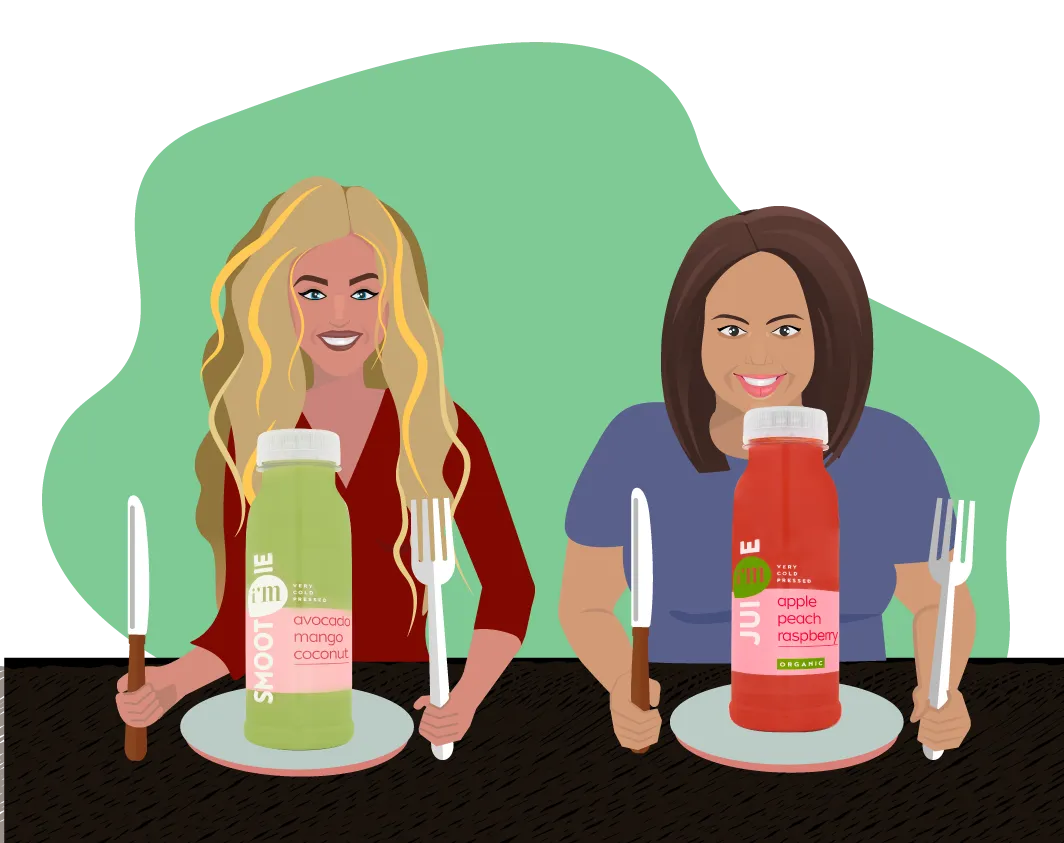
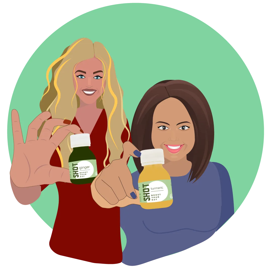
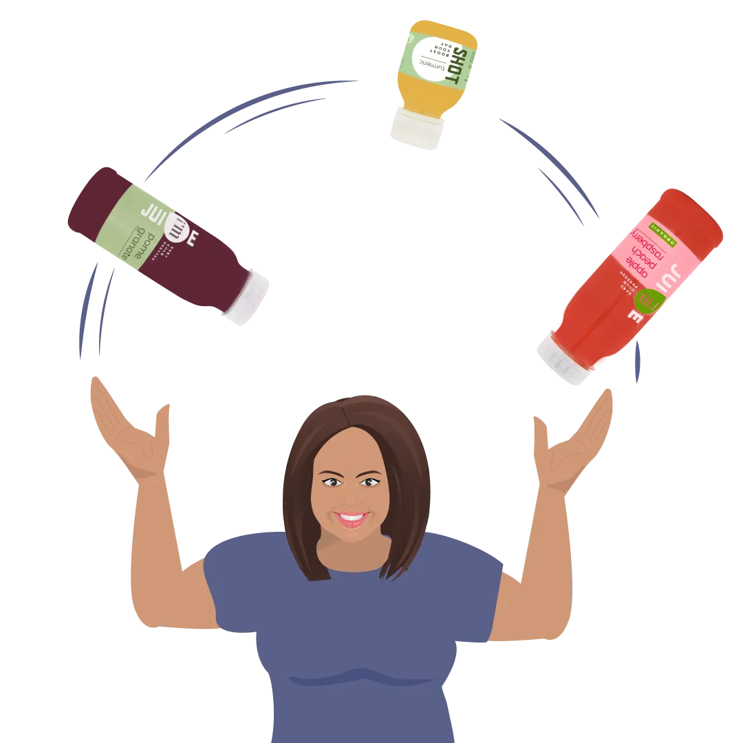
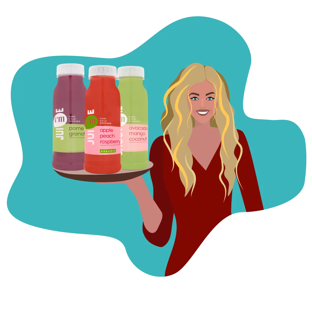
Delicious, cold-pressed juices, smoothies and shots, delivered fresh to your home as a separate package or as a detox juice cleanse with personal coaching.
For this client, I illustrated all the assets that go on their website and Instagram.
9 pieces · 1 motion

Logo Design.
Branding & identity
A set of logo and identity explorations.
6 pieces
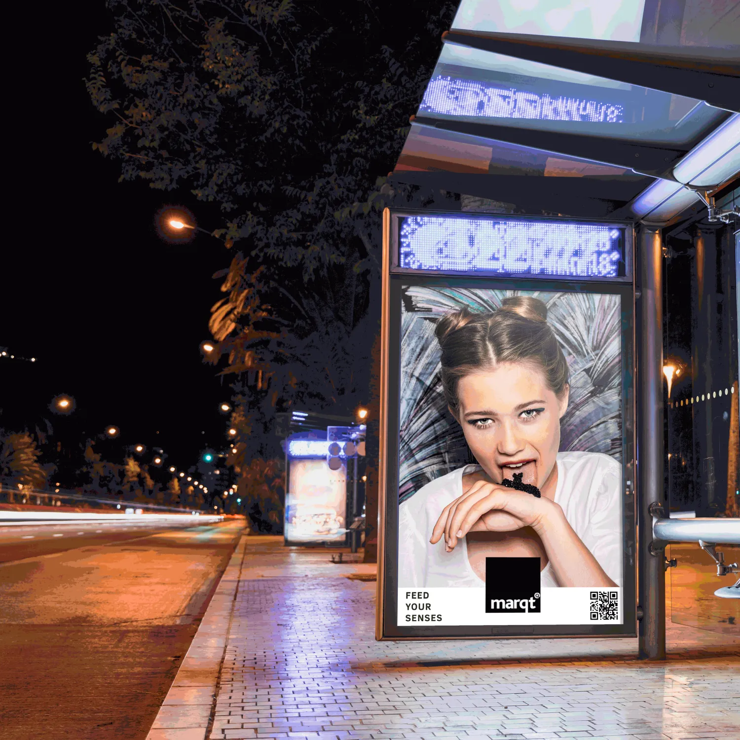
Feed Your Senses.
Art direction
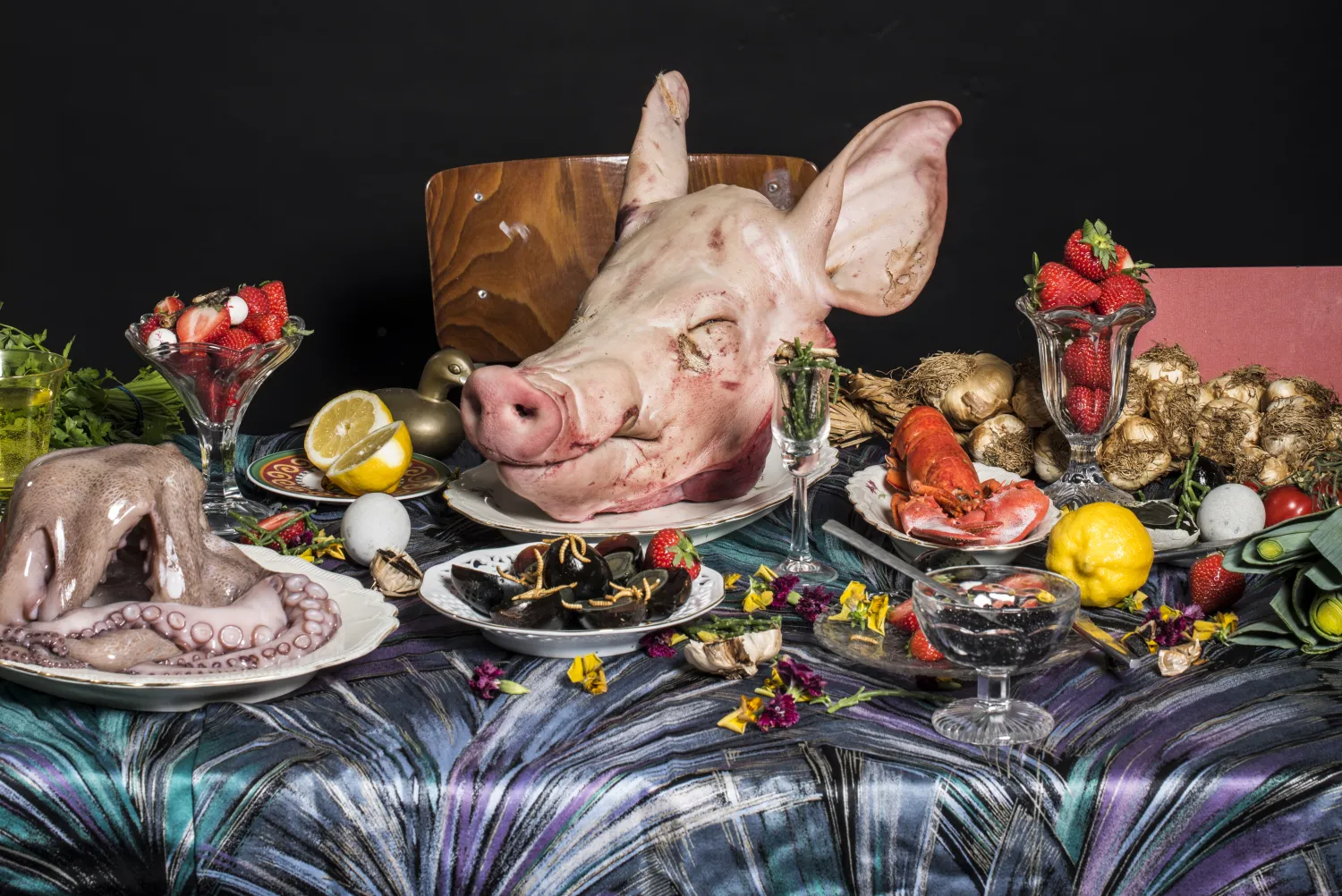
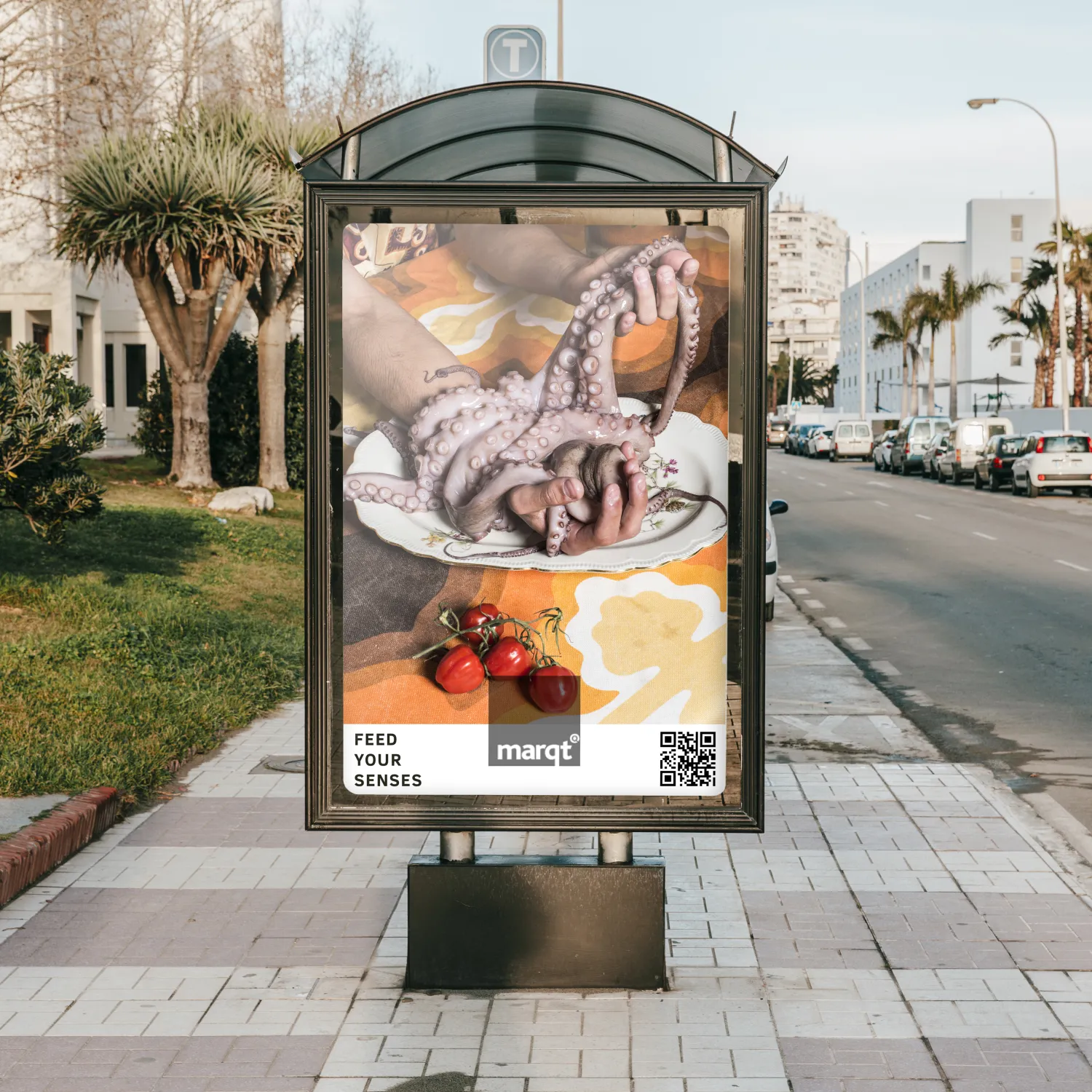
The brief was to create visuals and an app for consumers to shop in Marqt, a Dutch supermarket, based on their 5 senses: touch, feel, see, hear and taste. The concept was simple and the challenge was to make it look visually intriguing. This assignment was made in collaboration with Jorinde Bax.
3 pieces
KLEAR.
Illustration & motion
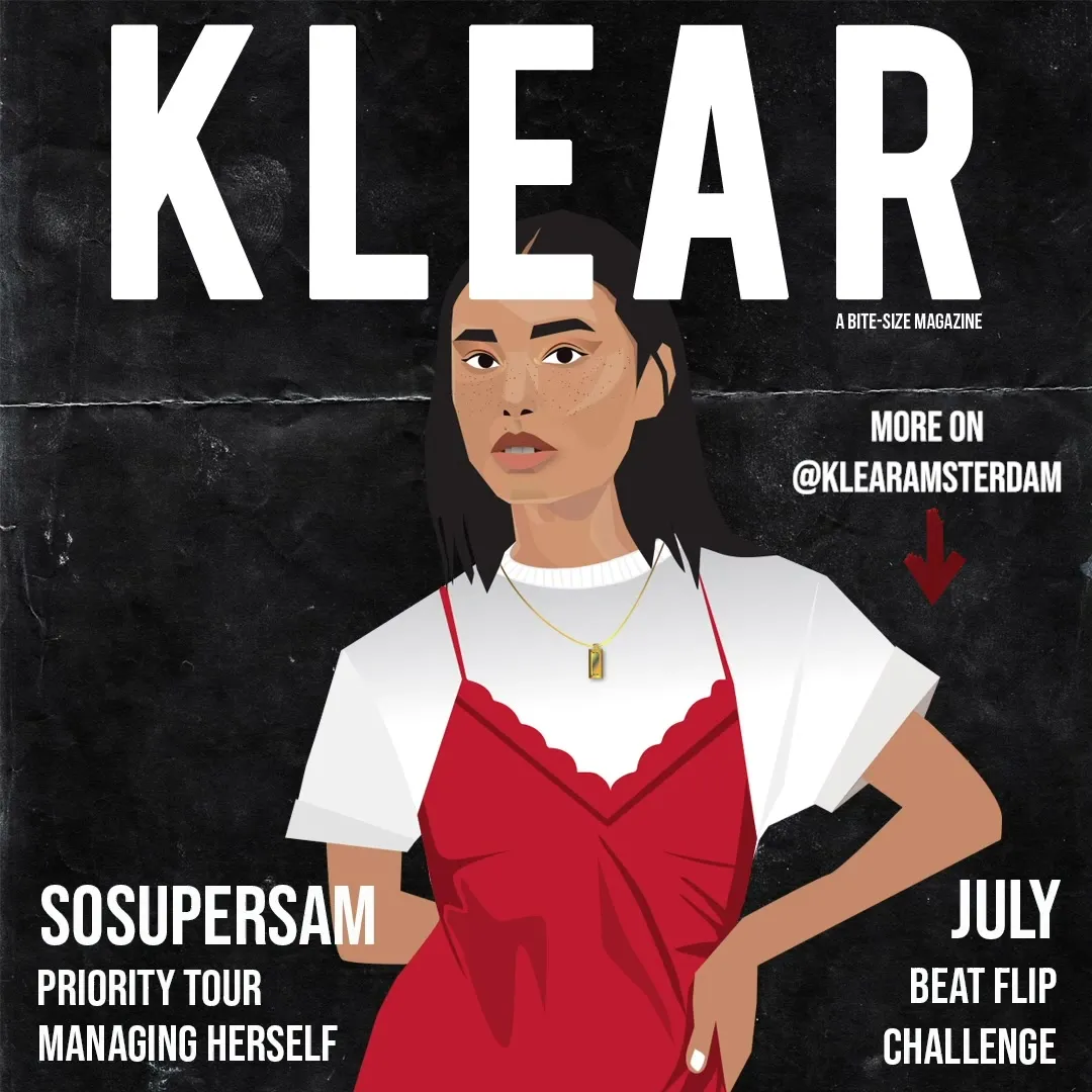
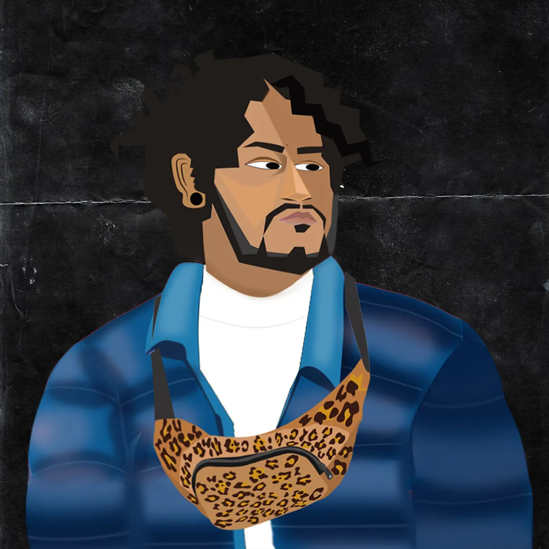
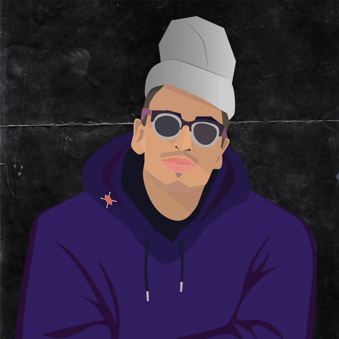
KLEAR Amsterdam is a party-event company in the Netherlands that throws parties in Paradiso and during ADE. For their social media page, I illustrated 3 of their featured DJs of the month, and made GIFs and a short moving image with music.
5 pieces · 1 motion

FutureBens.
Building an ESG platform
Futurebens is a Start Up from Berlin that has recently acquired the B-Corporation label on social and environmental performance. They collaborate with companies and provide employees access to educational and discount marketplace products built around sustainable consumption and awareness. (B2B2C business model)
From being just a marketplace for discounts and vouchers, Future Bens now wants to become an ESG platform.
Challenge
They have attempted to go in this direction by including an educational section with content on sustainability and social impact, as planet talks and good actions. But it still lacks user engagement. They want to make it visible and more interactive with users.
Must Have's
To create more user engagement across ESG. Desire to make the plat form more interactive.
Business Competitor Analysis
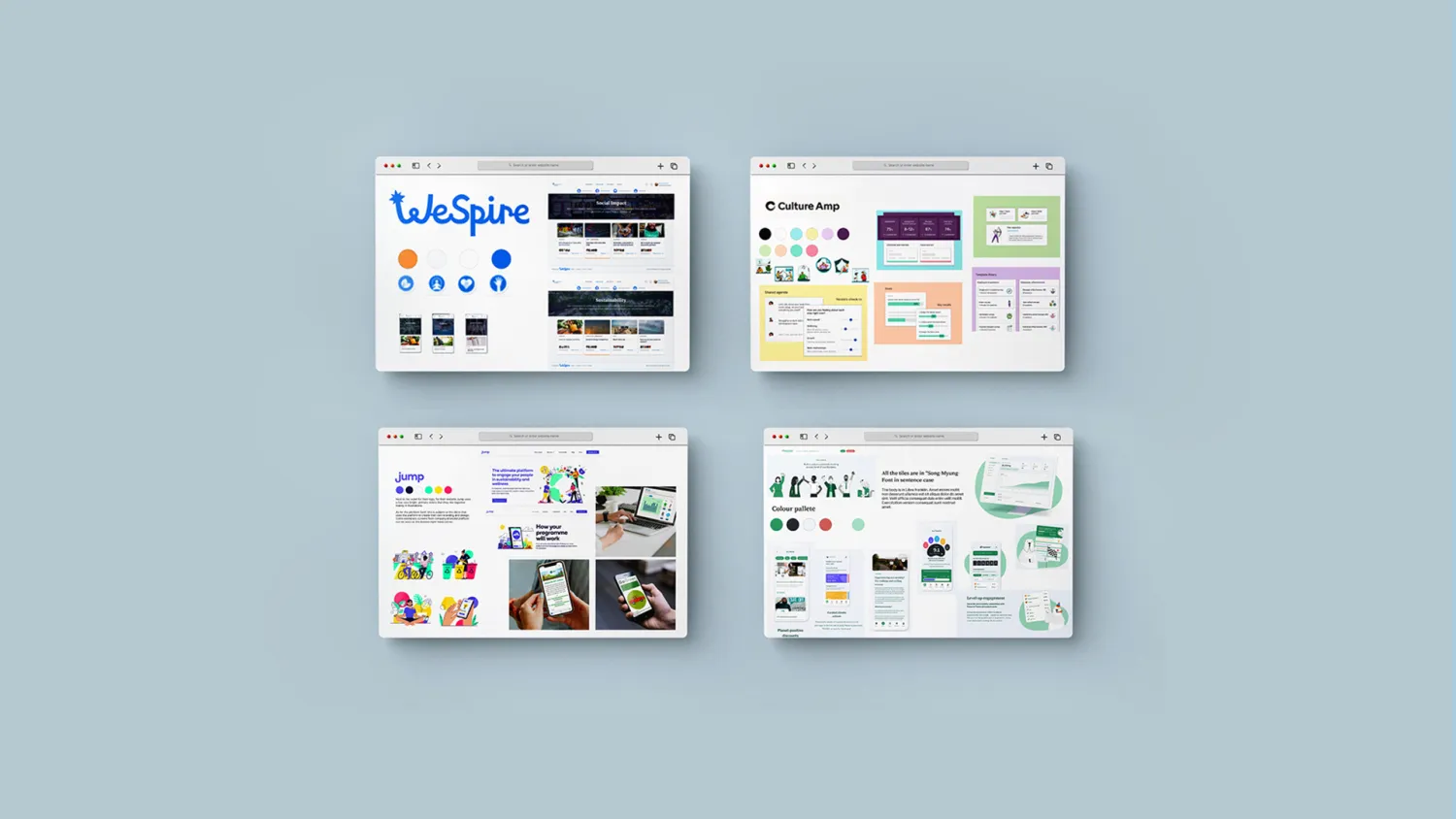
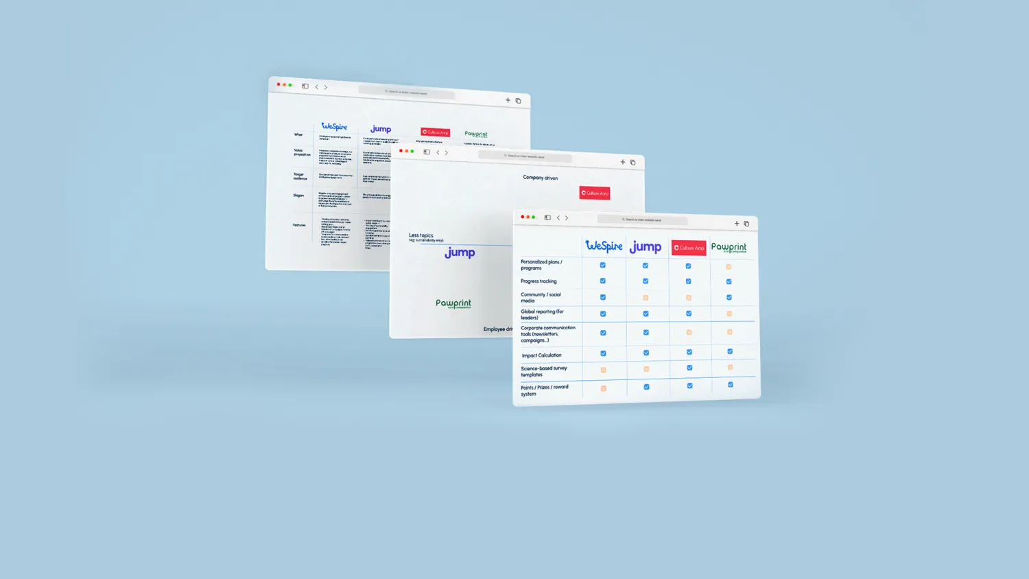
To inform the design of Futurebens' ESG platform, we conducted a competitive analysis of several companies in the market, including Wespire, Jump, CultureAmp, and Pawprint. While these companies share a similar goal of engaging employees and individuals in ESG topics, they position themselves differently in the market and have unique features and functionality.
Pawprint is focused on the individual impact of employees, while CultureAmp is more company-driven and focuses on employee progress and satisfaction. Jump, on the other hand, focuses exclusively on environmental topics, while Wespire covers a range of environmental and social topics.
We analyzed the strengths and weaknesses of each company's product and how they differ in functionality. This helped us identify potential areas of differentiation for Futurebens' ESG platform, such as a focus on specific ESG topics or a more individualized approach to tracking progress. By understanding the competition and their unique value propositions, we can design a product that meets the needs and expectations of users while also standing out in the market.
User Research
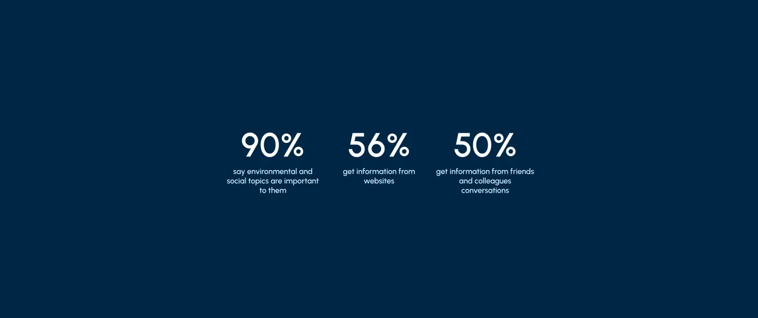
To better understand user needs and preferences, we conducted a quantitative survey of 50 people, consisting of 9 questions related to environmental and social topics. The results showed that 90% of respondents considered these topics to be essential and that they were a crucial factor in choosing their employer.
Furthermore, we learned that people primarily obtain information about environmental and social topics from websites, as well as conversations with friends, family, and colleagues. These insights will help inform the design of Futurebens' ESG platform, ensuring that it meets users' needs and preferences and aligns with their values and priorities.
We will use these findings to prioritize content and features that are most relevant and engaging to users, such as easy access to information about specific ESG topics and opportunities to connect and collaborate with colleagues and other users around shared interests and values. By designing a product that meets users' needs and preferences, we can increase engagement and create a more meaningful and impactful user experience.
User Interviews
We conducted five user interviews focused on understanding millennials' perspectives on ESG topics in both personal and work environments.
Through these interviews, we found that sustainability and social factors played a critical role in the decision-making process for three of the five interviewees when choosing their current employer. These individuals felt a strong alignment between their personal values and those of their employers.
The other two interviewees had different motives for choosing their employer, but both expressed an interest in environmental topics. One of them was taking personal initiatives to reduce their environmental impact, while the other expressed a desire to learn more about ESG topics but was unsure where to find reliable information.
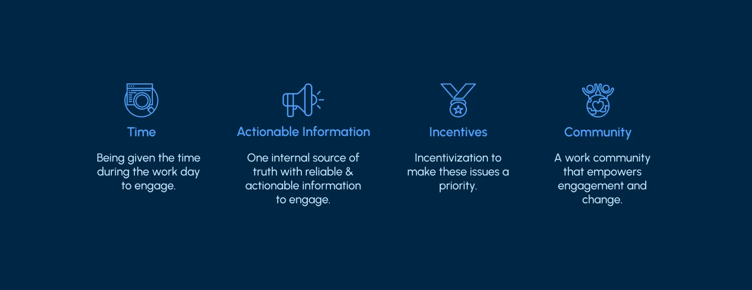
“My company follows some of the ESG topics but I just don't have time for it”
“I don’t whom to talk to within the company that might be interested in these topics as well”
“I don’t get any incentive to follow the ESG guidelines from my company so I am not too bothered about it.”
“My company flows a lot of ESG rules because they have to as they are an aeronautic company. But they don’t share all the knowledge with everyone, I would like to be more included.”
These insights will help us design a more targeted and effective product that meets the needs and expectations of our target audience. By understanding the diverse motivations and behaviors of users, we can create a product that is engaging, informative, and aligned with their values and priorities. For example, we can prioritize features that promote personal initiatives and information sharing around ESG topics, while also providing easy access to reliable and curated information. By doing so, we can create a more impactful and meaningful user experience that resonates with our users.
Card Sorting
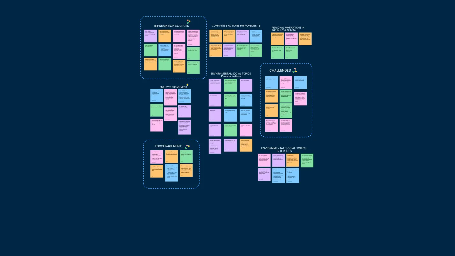
From the 5 interviews, we built an affinity diagram to find some patterns and dot-voted.
Key Insights
User Persona
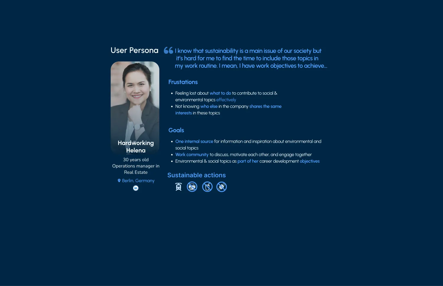
Helena is aware of the importance of engaging in environmental and social topics. She does waste segregation at home and is interested in recycling and animal welfare, but due to her busy schedule, she cannot learn more about it. Moreover, she cannot find reliable and easy-to-consume content, nor does she know which other work colleagues might be interested in the same topics as her or who can motivate and encourage her.
User Journey Map
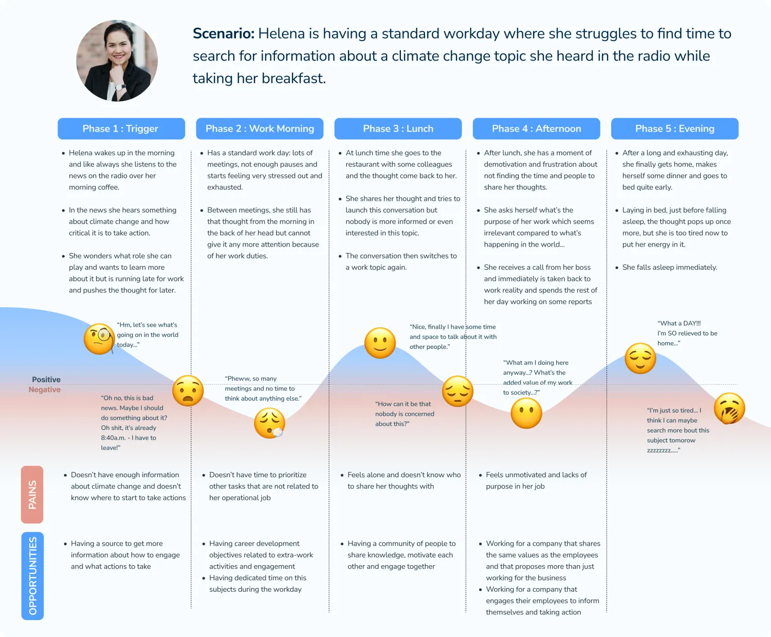
We then created a user journey map focusing on how Helena feel during one of her regular days. By mapping Helena's Journey map, we are able to clearly see her pain points, as well as find possible opportunities to develop a product that truly would help.
Problem Statement
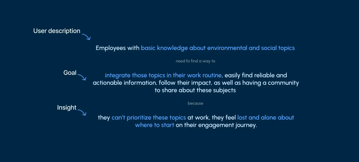
With a better knowledge of our users and an understanding of their pain points, we form our problem statement.
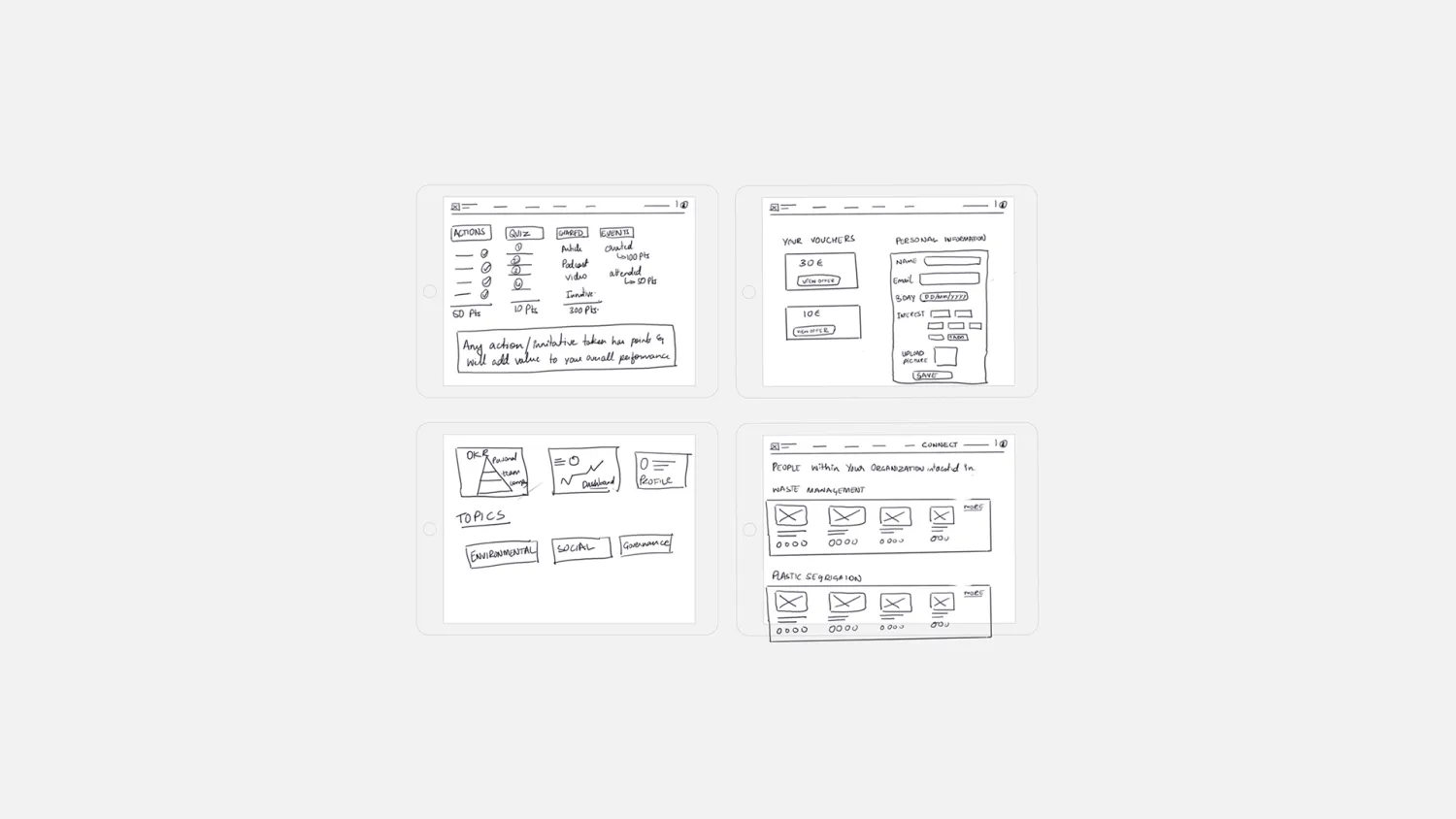
It was here that we came up with the point system/ reward system! Since our stakeholder- Ivan had mentioned gamification, the only way that makes sense for this platform to work is by collecting points on every single action. This idea set the foundation for our overall final product.
The other key features we got from the 28 ideas that we generated in 8 minutes were -Ability to take initiative and create a dashboard to track progress. We also had to consider the social and the company where our user Helena works- so objective setting from the company so that it is integrated within the personal growth part of the corporation.
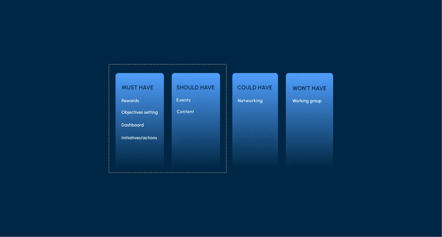
MOSCOW method
Placing the Working Groups feature in the won't have sections for now because we weren’t sure if companies would allocate time for it on a regular basis and we were unable to decide who would take the initiative so due to uncertainties we decide this feature will be in the won't have.
Networking went into "Could have": it's a great way to find people who share your interests within the organisation, but we needed to look deeper into whether this would be a social chatting platform or only a contact-info page — so we kept it for the next version of the platform.
Minimum Viable Product
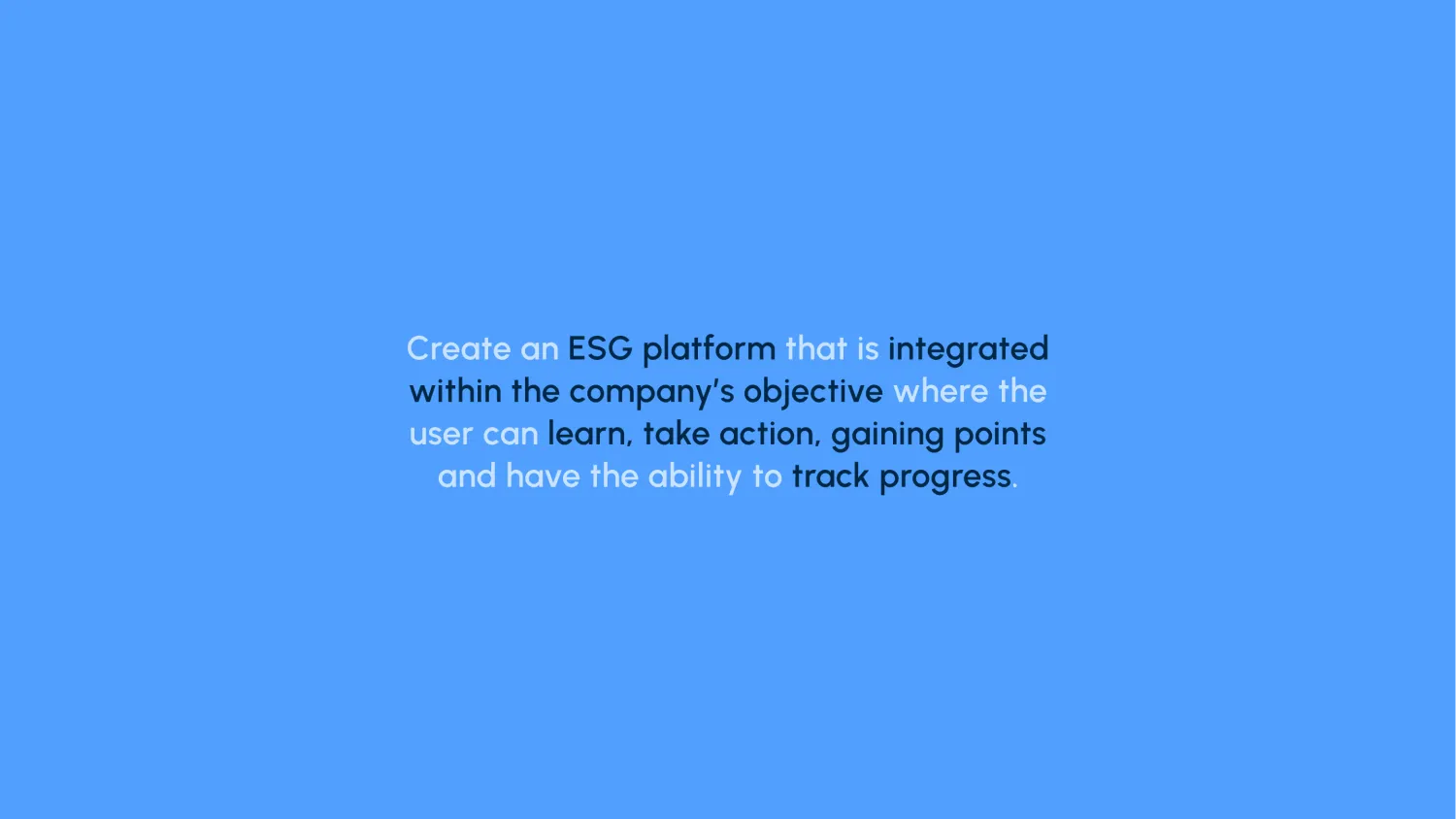
Create an ESG platform to learn, take action, and get points by having the ability to track progress as well as integrated it within the company objectives.
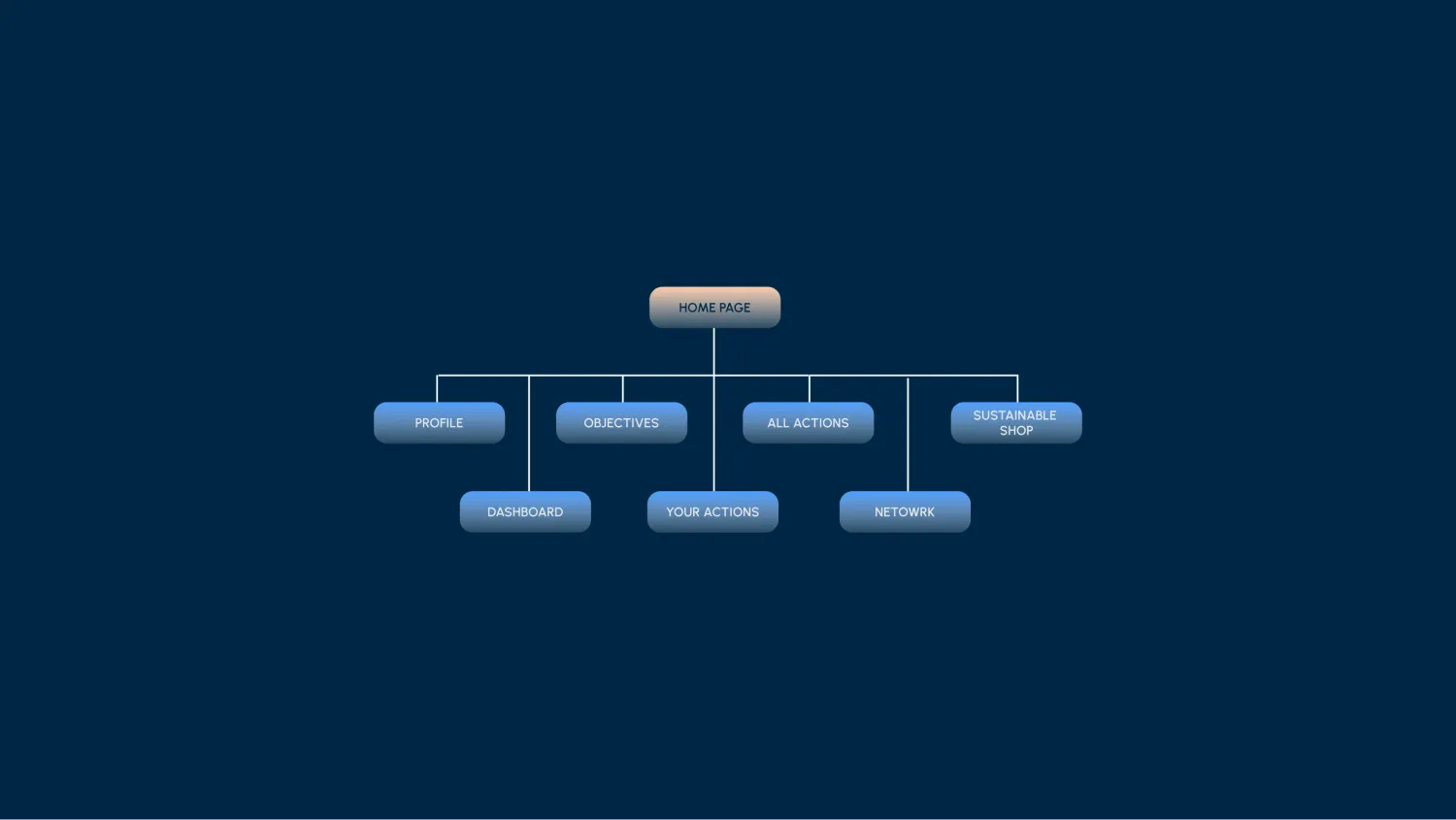
Site Map
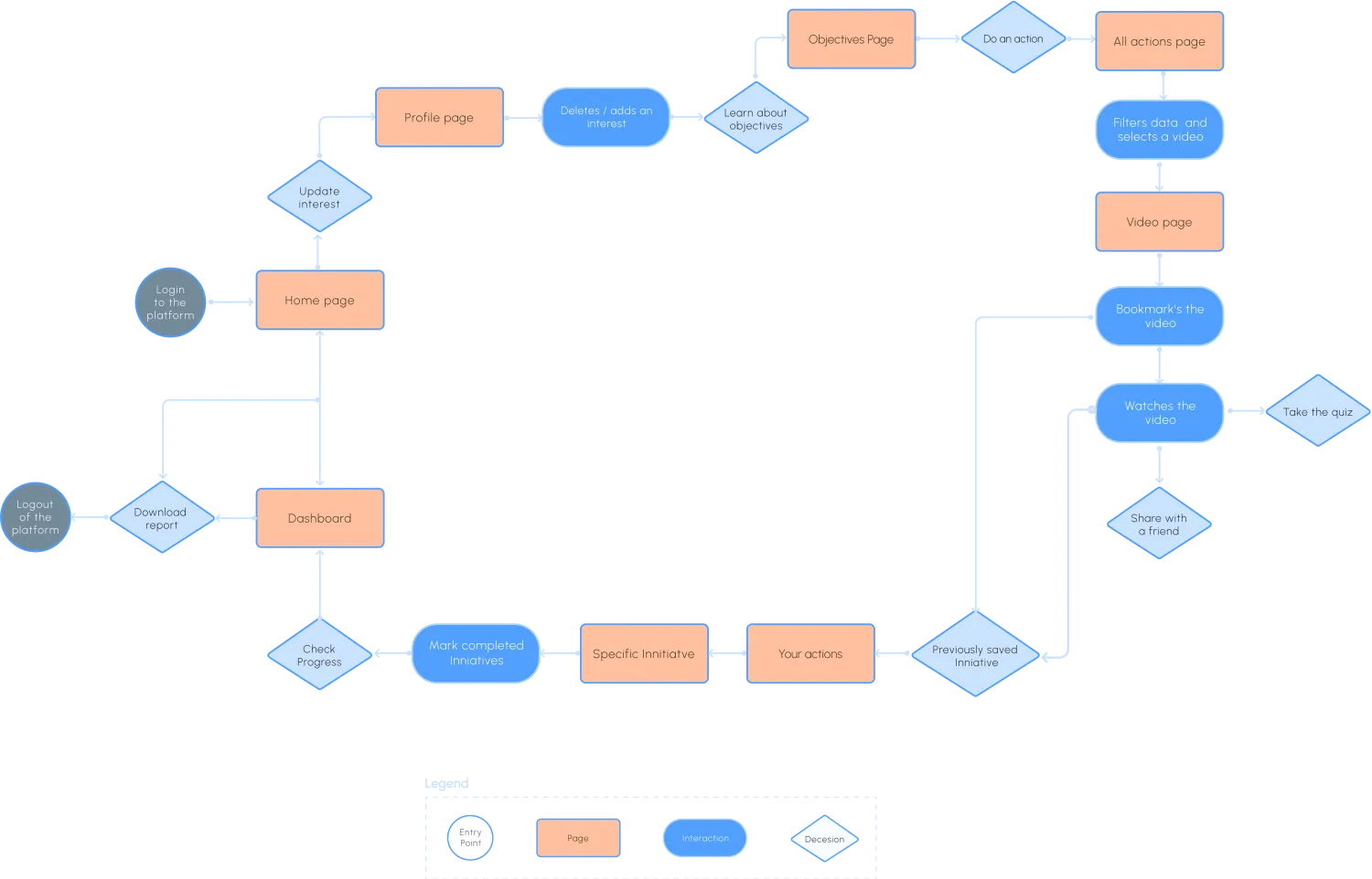
User Flow
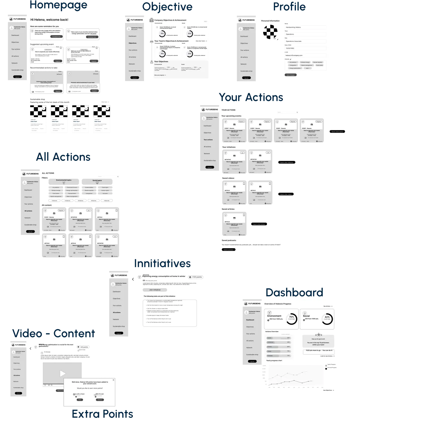
Mid Fidelity Wireframing
User Interface Design
Visual Comparative Analysis
When looking into WeSpire, CultureAmp, Jump, and Pawprint, as a group we came to an agreement that we like the Pawprint visual elements more but with some photographic elements from Wespire.
Style Tile
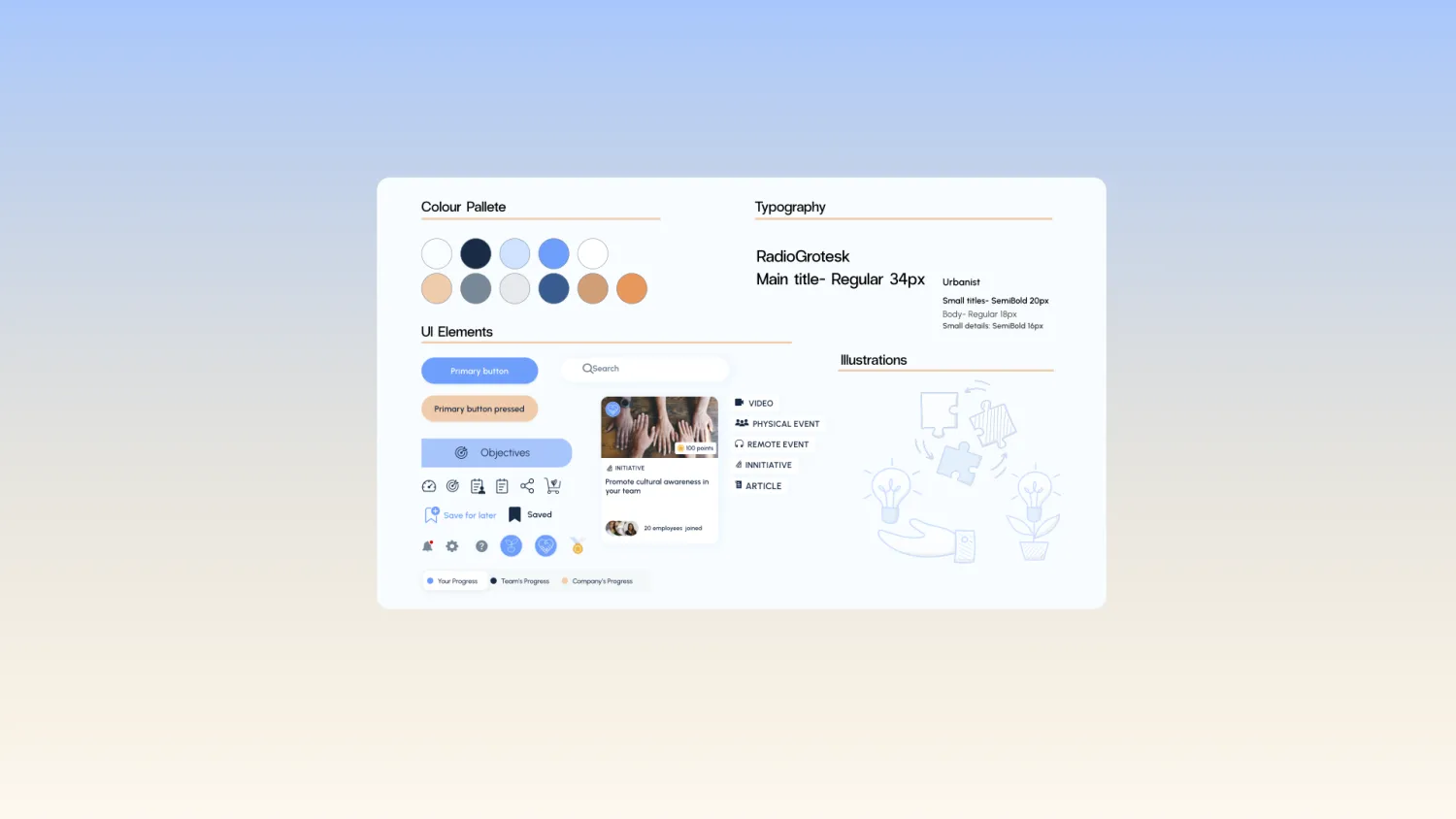
We then created a style tile. As Future Bens already has a website we didn't want to deviate too much from it. We just defined the primary and secondary colours, set the illustration style, defined the icons, tags, and buttons and set the typography with the right kerning.
High Fidelity Prototype
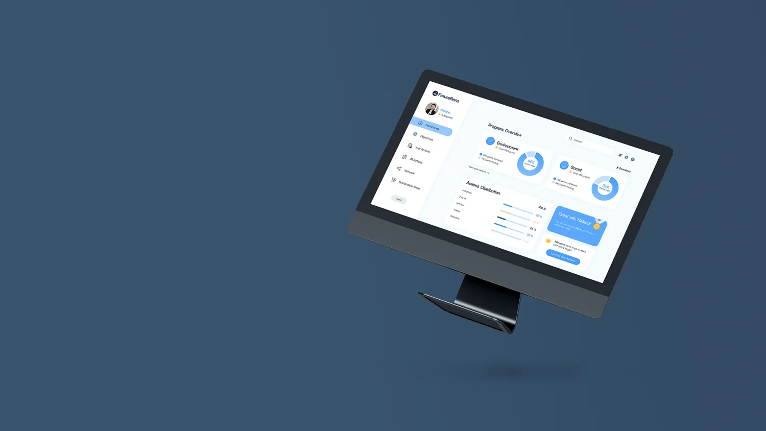
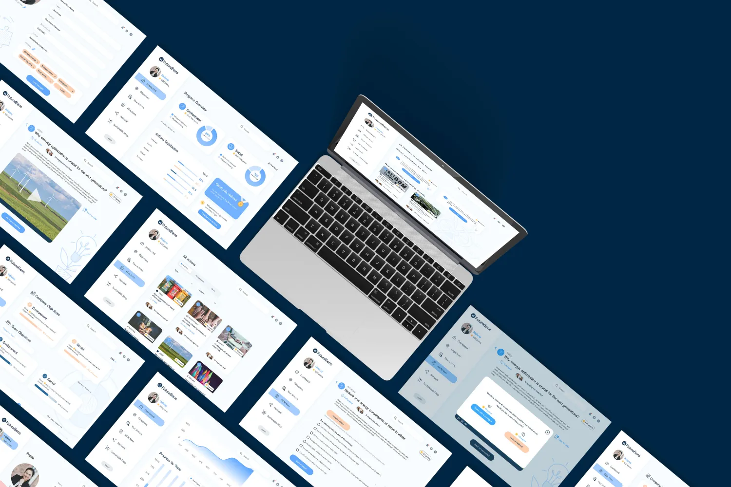
The home screen is a welcome back screen showcasing the recent activities and initiatives yet to be completed and recommendations based on your interests.
The dashboard is an action tracking page that can compare your progress with your teams and company objectives.
All Action is a page with the ability to narrow your search on the bases of types of actions, environmental or social and further narrow it by topics and categories.
Your actions are on a separate page that showcases all the bookmarked actions.
For the part of gamification, we added the option of scoring extra points by taking a quiz after watching the video or sharing it with a friend.
Keep the overall look clean and minimal in line with the FutureBens website. We presented this and won the best project award.
Desirability Testing
18 pieces
Qwwweero.
An inclusive wellness app for the queer community
The Brief
The Daily Health Conference is a non-profit organisation dedicated to promoting health and wellness through impactful public talks, participatory workshops, and professional training all over the world.
Even though they have been up and running since 1983, their programme has been slow to catch up with technology. They are very excited to explore how technology can be used to help people live healthier lives.
The Challenge
The Daily Health Conference wants designers to rethink how people can adopt and commit to a health-improving routine.
The app should monitor the users’ progress and encourage them to adopt a healthier lifestyle.
Users must retain control over their personal data (GDPR Compliance)
Designers will conduct user research to understand people’s relationships with mental, physical, and emotional well-being.
Designers will then create a prototype for a tool that will motivate them to take action
Must Have's
Users need to be able to set up their profile to include important information relevant to their goals
Users need to be able to set goals and track their progress
Users need to be able to edit, share or delete their personal data
Users need to be informed about the usage of their personal data (This is an opportunity to practice UX writing)
Users need to receive feedback from the system (empty states, errors…)
Secondary Research
Quantitative data through Survey
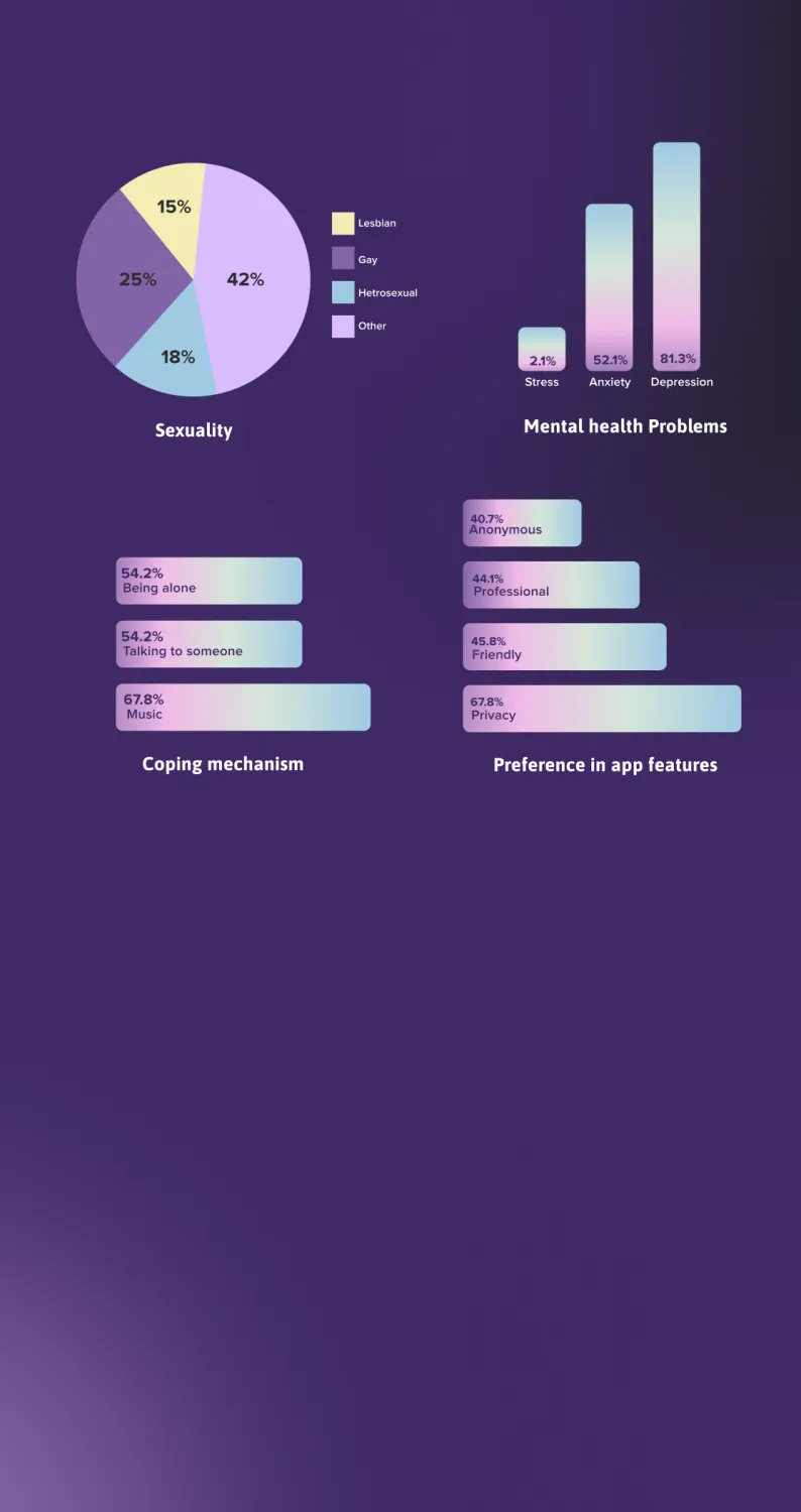
To validate our assumptions and quantify the information, we created a survey with 8 questions that was completed by a total of 60 people with more than 80% considering themselves LGBTQ+
This helped us define our target group! Its key to get a clear idea of who are users will be so that we can interview them and find out their pain points.
81.3% said they deal with depression and 52.1% with anxiety. 54.2% of the people prefer talking to someone and being alone, equally.
To find out more about what their expectations are within the App world, we asked our target group to choose 3 words from the list of contradicting features which included: 67.8% prefer privacy, 45.8% prefer friendly, 44.1% prefer professional, 40.7% prefer anonymous.
Primary Research
Qualitative research through interviews
Conducted 6 user interviews! We spoke about their mental health, if they have something that triggers them and how they deal with it! The one word that kept coming up throughout our conversation was Inclusivity.
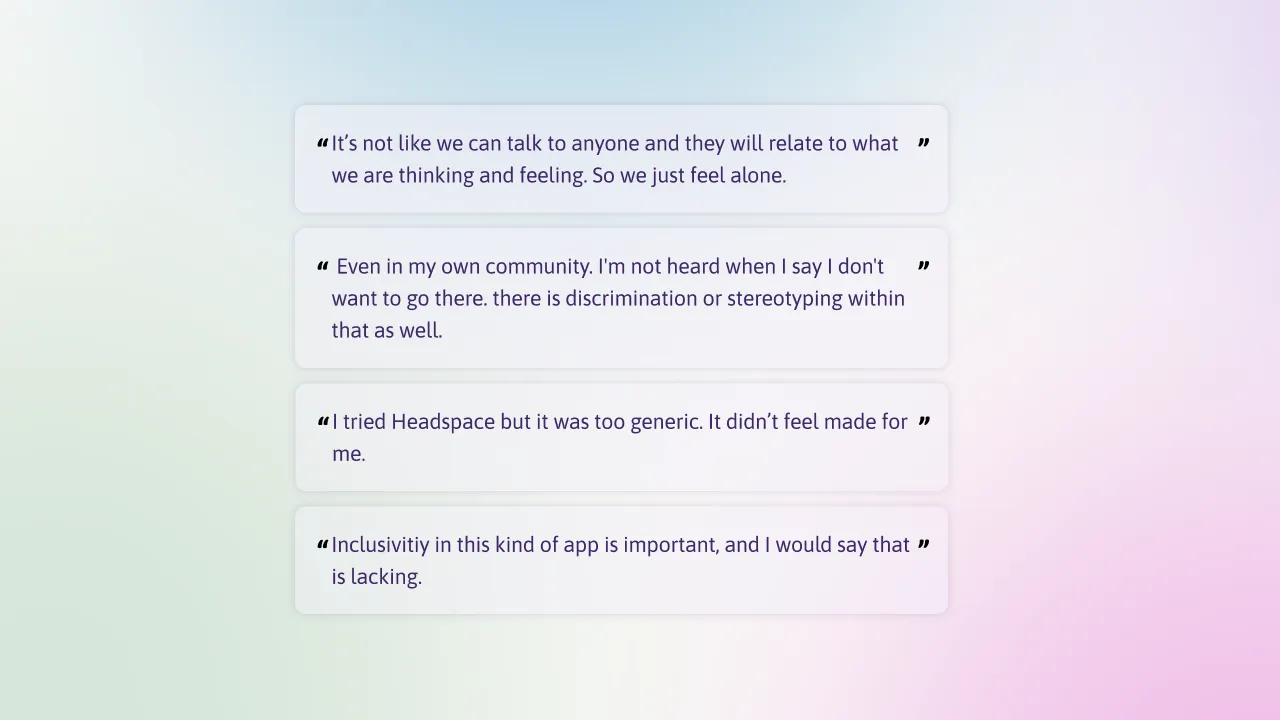
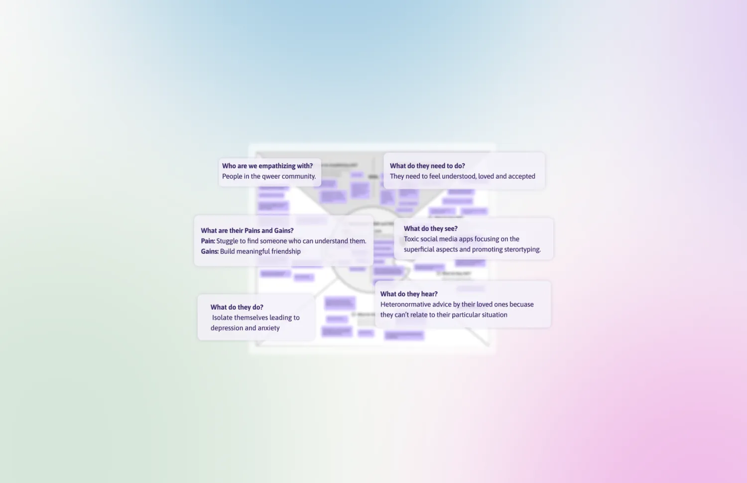
Empathy Map
Defining and validating the qualitative data from the interviews
We empathise with the People in the queer community. As they need to feel understood, loved and included because they keep hearing heteronormative advice from their loved ones which aren’t really applicable to their situation.
They see toxic social media apps focusing on superficial aspects and promoting stereotypes and also sometimes feel excluded by their own community due to the same.
This leads them to isolate themselves, causing depression and anxiety as they struggle to find like-minded people and build meaningful friendships.
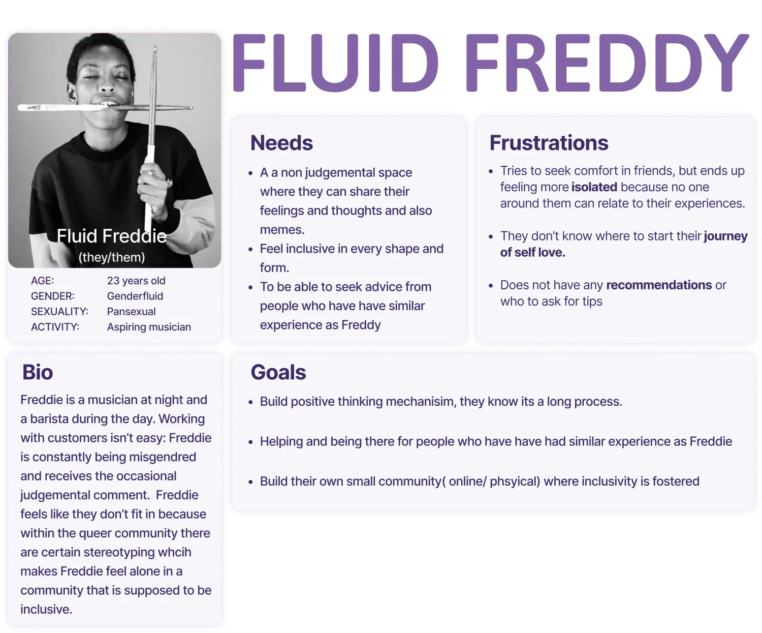
User Persona
Consolidating our information we created our primary user persona Fluid Freddie — a barista during the day and a Jazz musician by night! Fluid Freddie is constantly having to explain their identity, being misgendered and receiving judgemental comments.
Here we observe Freddie, needs a space where they can connect, and make friends with people, who share similar interests and might have had similar experiences. Freddie’s goal is to build a positive thinking mechanism, seeking comfort and also comforting others who are in similar shoes as them.
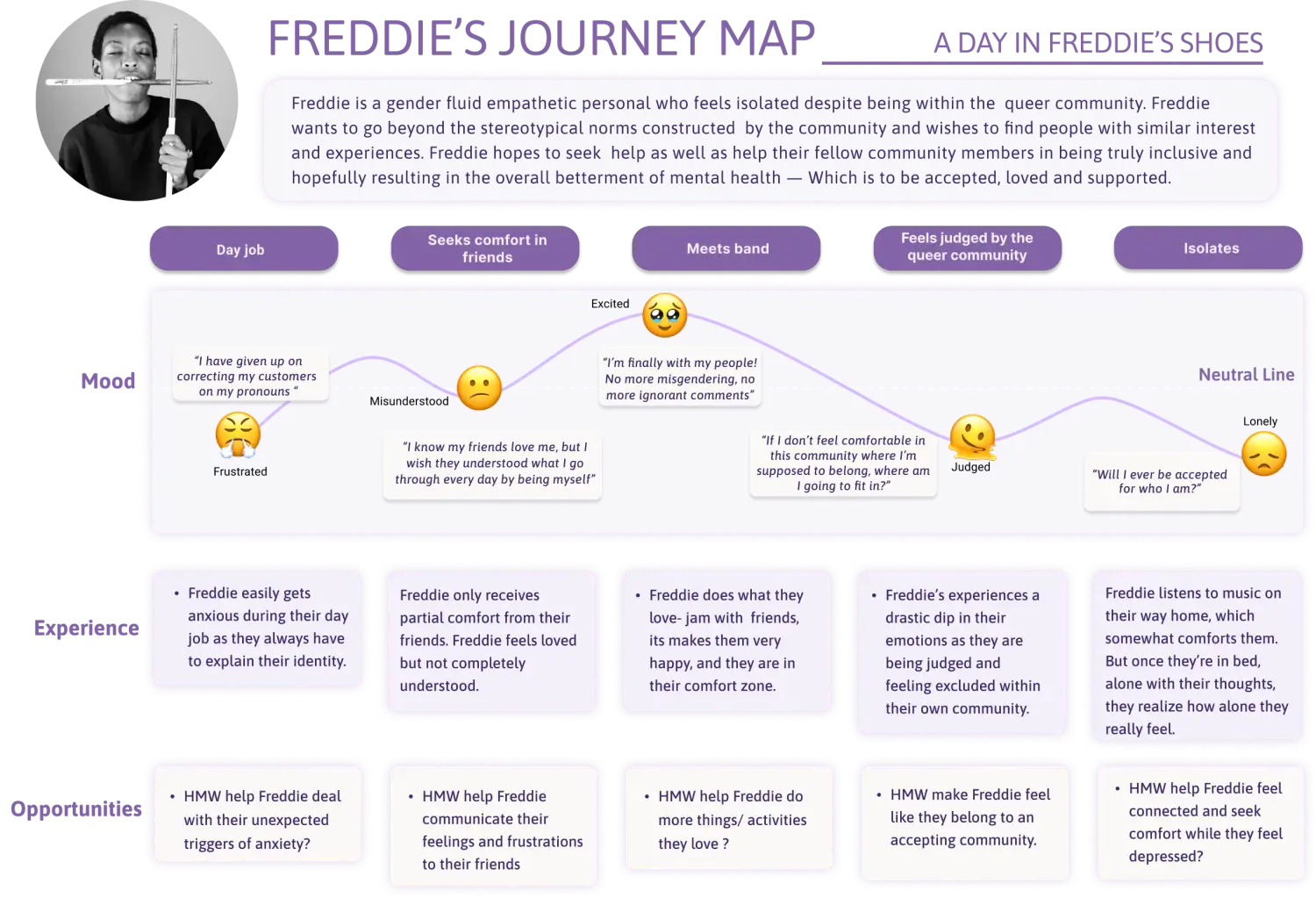
User Journey
Freddie typically starts their day working as a barista! Often circumstances make them feel anxious and frustrated while at work. Sometimes, a passing comment, other times a joke which might be funny to a lot but not Freddie.
After work, they try to seek comfort with friends but feel misunderstood as their friends are not in the same emotional place as Freddy.
Later that evening, Freddie is excited to go to play jazz in a club in Soho with their band but shortly after the Jamming session they feel left out and excluded because of stereotyping within the community. This results in Freddie feeling lonely and isolated with no one to hear them out or understand.
The Problem Statement
"Queer people need to build an inclusive support system because everything in the market excludes their experience."
MOSCOW method
Brainstorming a list of features, categorising in the form of the Moscow Method. We not only focus on the Must haves and Should haves from our database. But also take into consideration the Must-haves of our Client which is the ability to see progress.
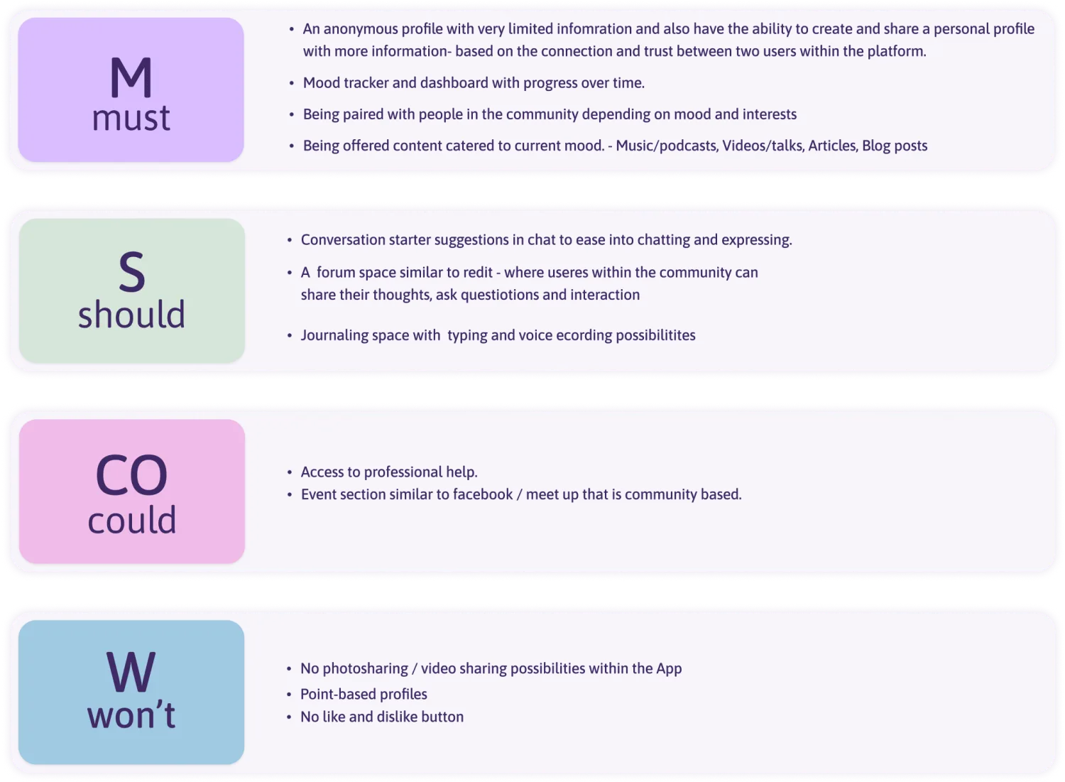
Minimum Viable Product
This app will allow Queer people to connect with and build meaningful friendships with fellow queer people who share similar interests, without being judged on the superficial aspects.
Concept Ideation
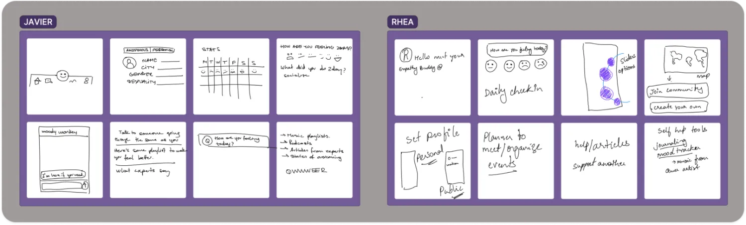
To begin ideation, we got back to the start — the survey! We extract the information such as preferred words which are: privacy, friendly, professional and anonymous. Looking into our user interviews and empathy map we begin sketching out concepts through the Crazy 8.
The process of creating 8 ideas/drawings in 8 minutes so 1 minute per sketch is a fun and effective way to generate ideas!
After 8 crazy sketches and 8 minutes later we noticed similarities in our idea. We decided on a few key points such as a journal feature, the ability to chat and support each other, having an anonymous and personal profile, and the planet/solar system kinda feel since we are trying to create a safe space!
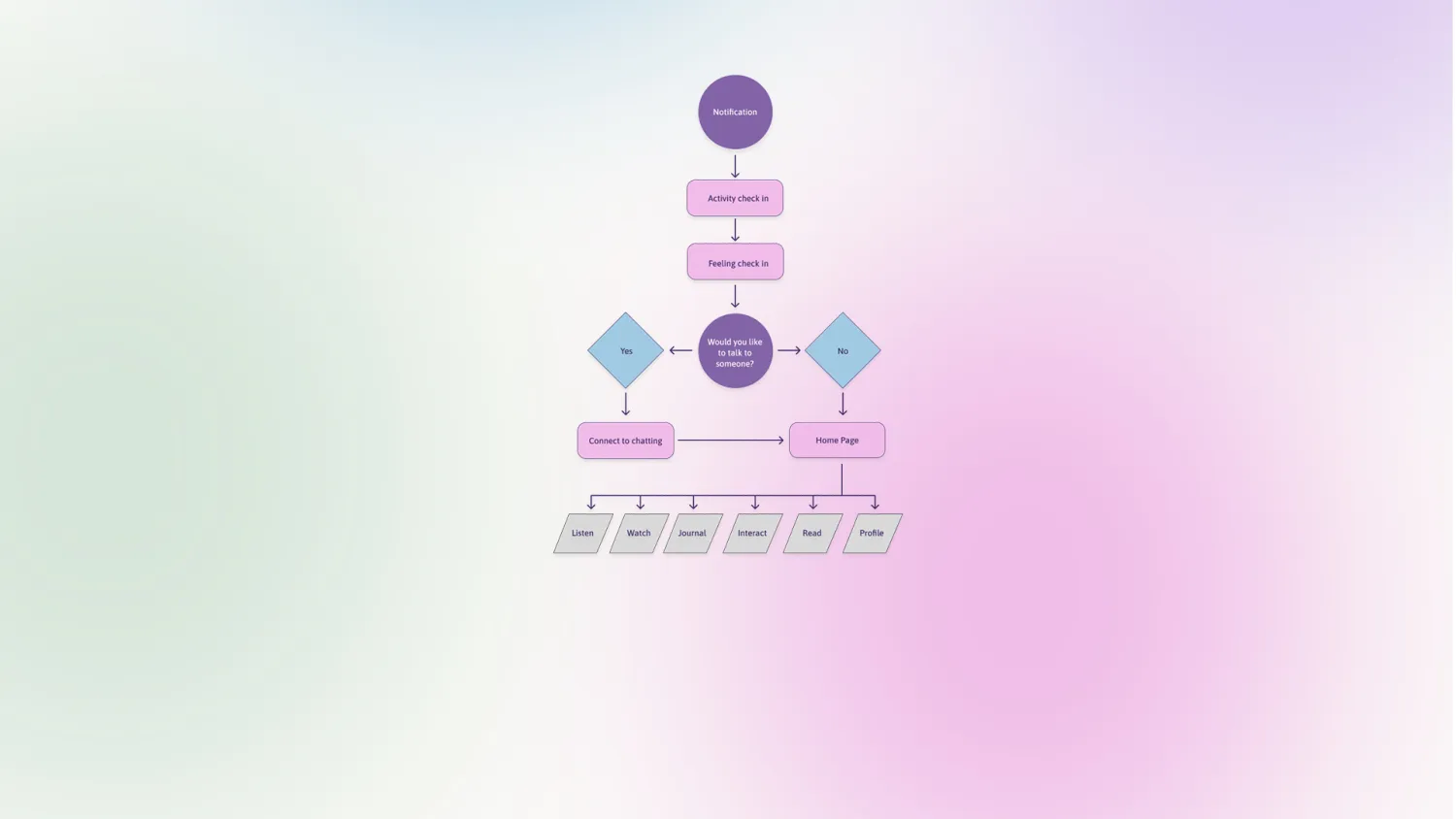
User Flow
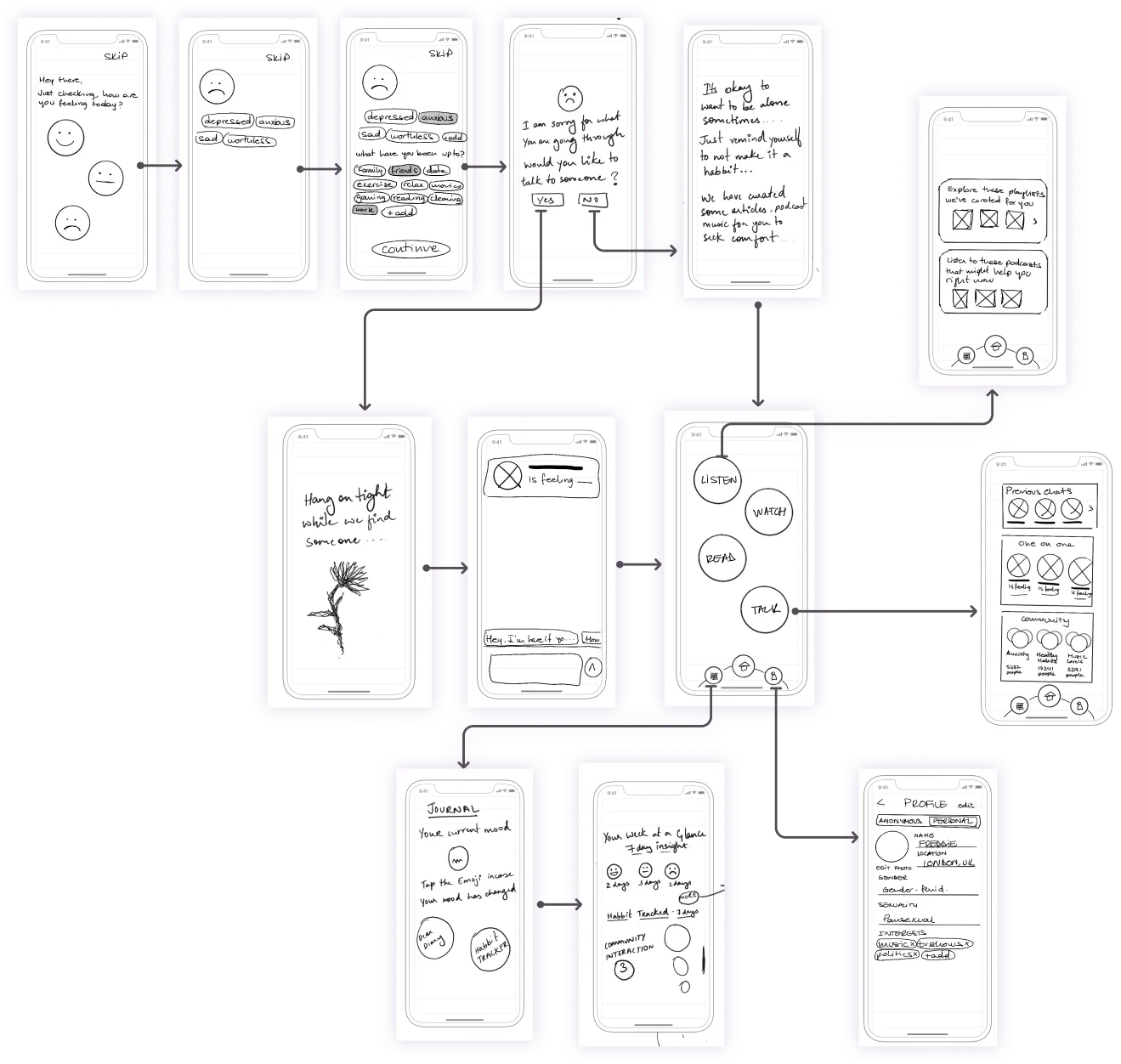
The user receives a notification where they are asked how they are feeling. After entering some information they are asked if they would like to talk to someone. If they say yes they are matched with a person from the community who is feeling similar to our users and share the same interest. If they say no they are brought to the homepage, where they have access to curated content based on the feeling they entered when they got into our platform.

Low-Fidelity Wireframing
In the low-fidelity wireframes, we want to give the user the feeling of a safe space. Here, I worked on UX writing. Through our tone of voice we wanted the user to feel at ease and comfortable from the time they are on our app. We aimed to not overwhelm the user with too much information and keep it slow paced.
User Testing
We do some concept testing, which helps us in placing the screens in a certain order so that there’s no confusing information. By asking our testers what they expect to see before they press a button, we get some ideas on the wording we should use.
"I like how it checks the mood and then asks to elaborate more"
"I am glad it's not a bot that I am chatting with."
"I like that the person I am chatting with doesn't know me, but is feeling similar to how I am — this helps me easily express myself"
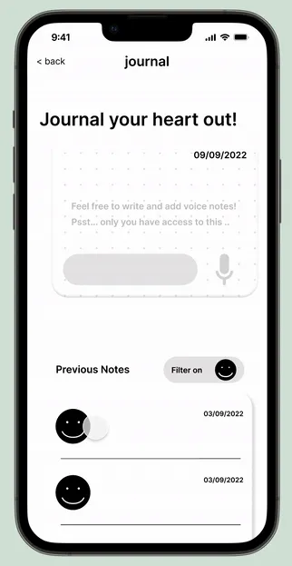
"I wish to have a voice note option in my journal, I find it easier to express myself as I talk."
Mid-Fidelity Prototype
We start solidifying our concepts, here we decided to keep everything in lowercase — to give a feel of texting your friend. We adjusted some features based on our Low-Fidelity testers.
"Like the tone of voice is very empathetic"
"Love that there are no capital letters — feels very casual and easy."
"The more I navigate through the app the more comfortable I feel."
"I would like to filter my mood and see what my happy and sad days were like, what I did."
User Interface Design
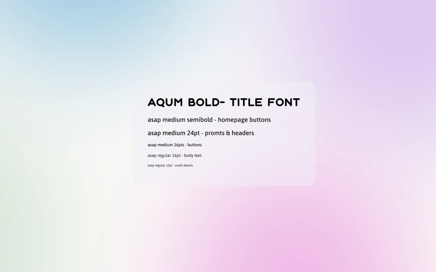
Typography
Keeping everything in lowercase which is slightly unusual at the start but as our users have tested it, they like it and find it friendly and approachable.
Brand Attributes & Mood Board
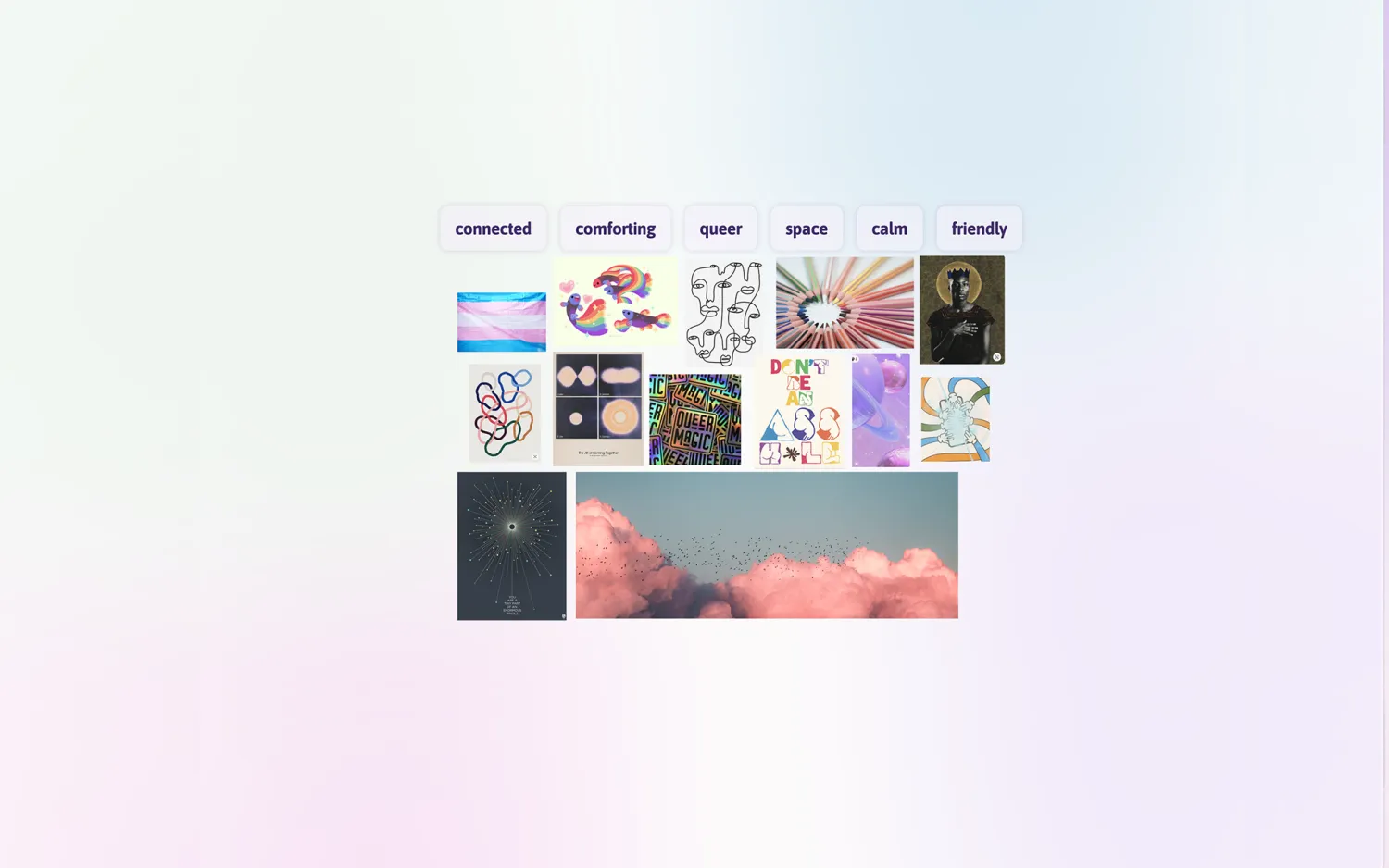
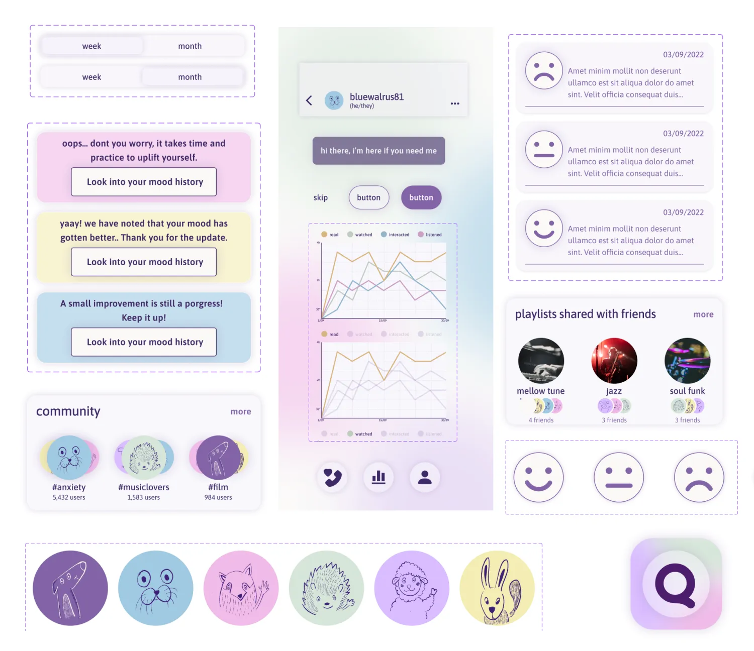
In this mood board, we really liked the idea of space. The holographic effect and the use of purple spoke the most to us. The clouds give a soft comforting cushiony feel.
Colour Palette
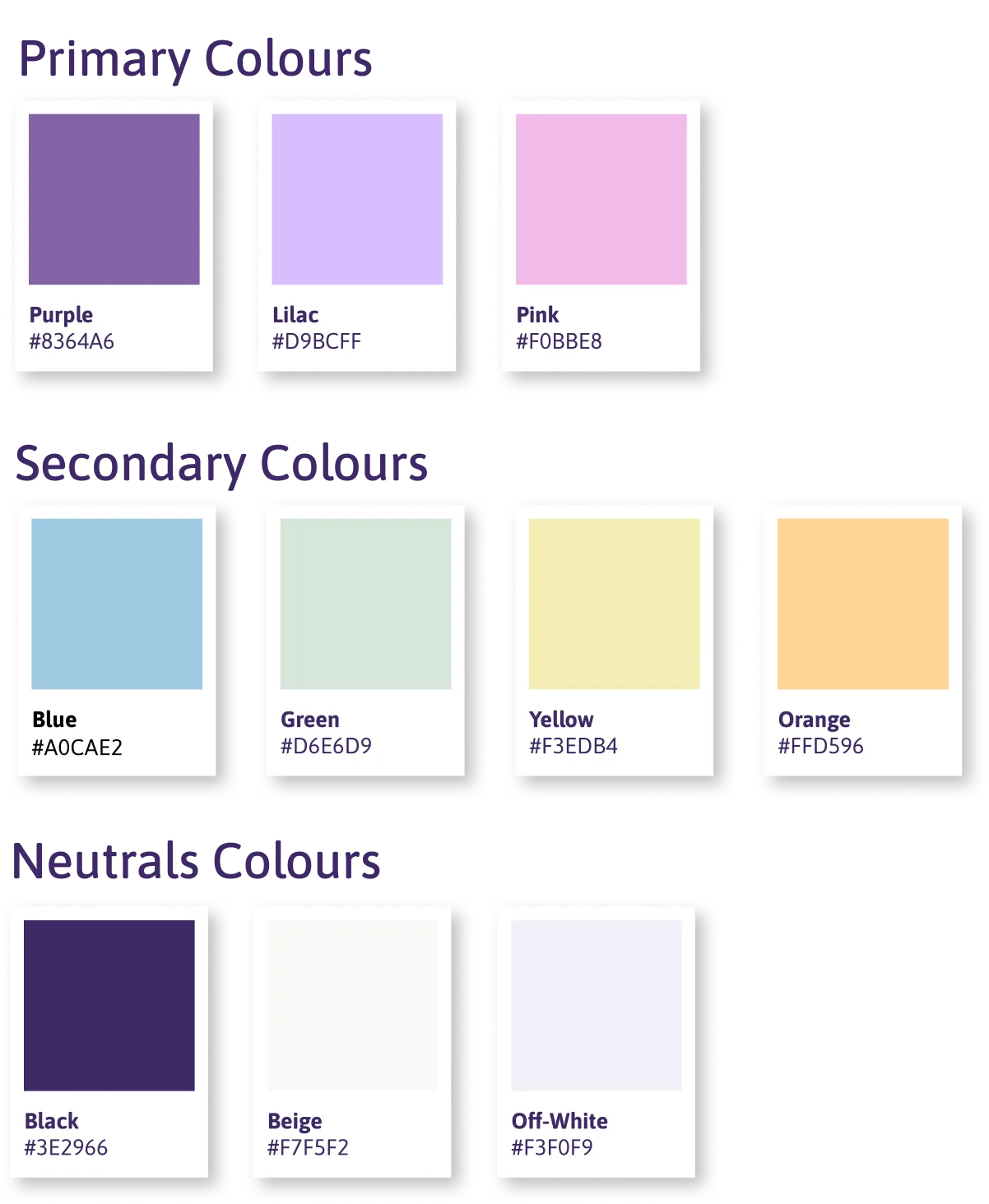
Keeping consistent with our mood board, and brand attributes, we opted for soothing, soft colours. Our final selection resembles the colours in the pride flag but is very subtle, muted and yet welcoming.
Naming the App
Qwwweero = Queer + Hero. Made for the Netizens.
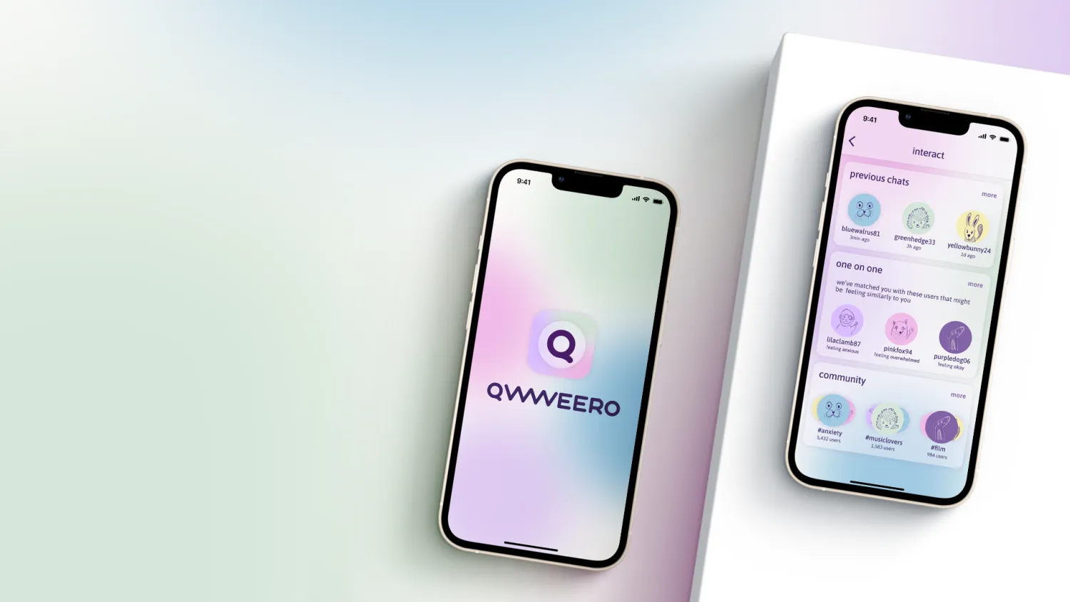
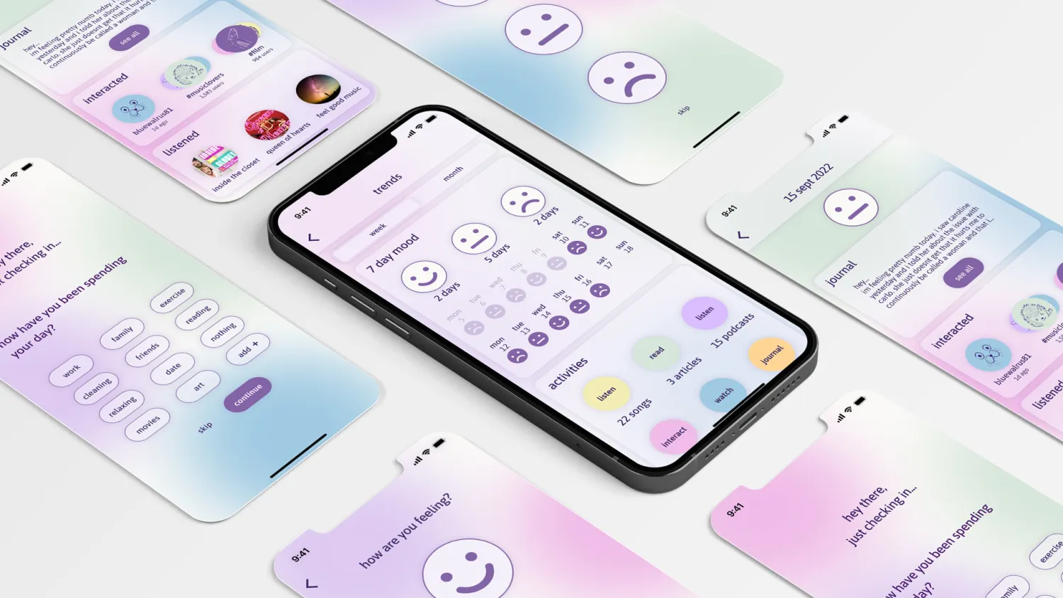
High Fidelity Prototype
Focusing on UX writing and slow-paced guiding, making sure the user feels at ease from the start and is willing to open up more.
Daily Check-in
Being mindful and taking the friendly guiding approach — the user receives a notification during the day. The check-in includes 3 simple steps.
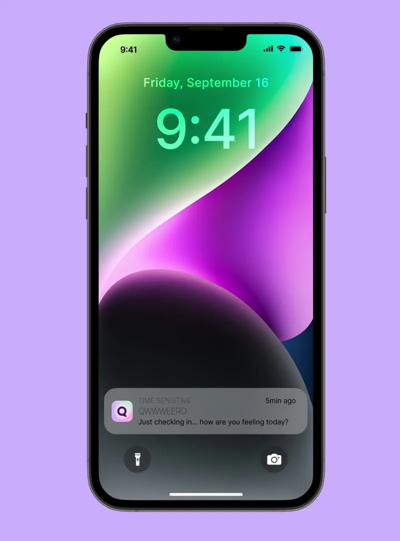
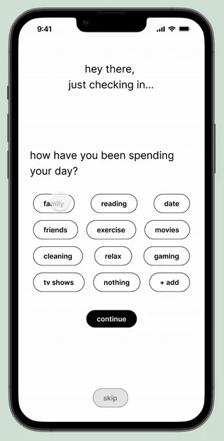
Yes — Path
Suppose the user chooses to interact then they are connected with another person using the platform who has similar interests and is in a similar mood. The interaction will be totally anonymous — keeping our MVP at heart and privacy in mind.
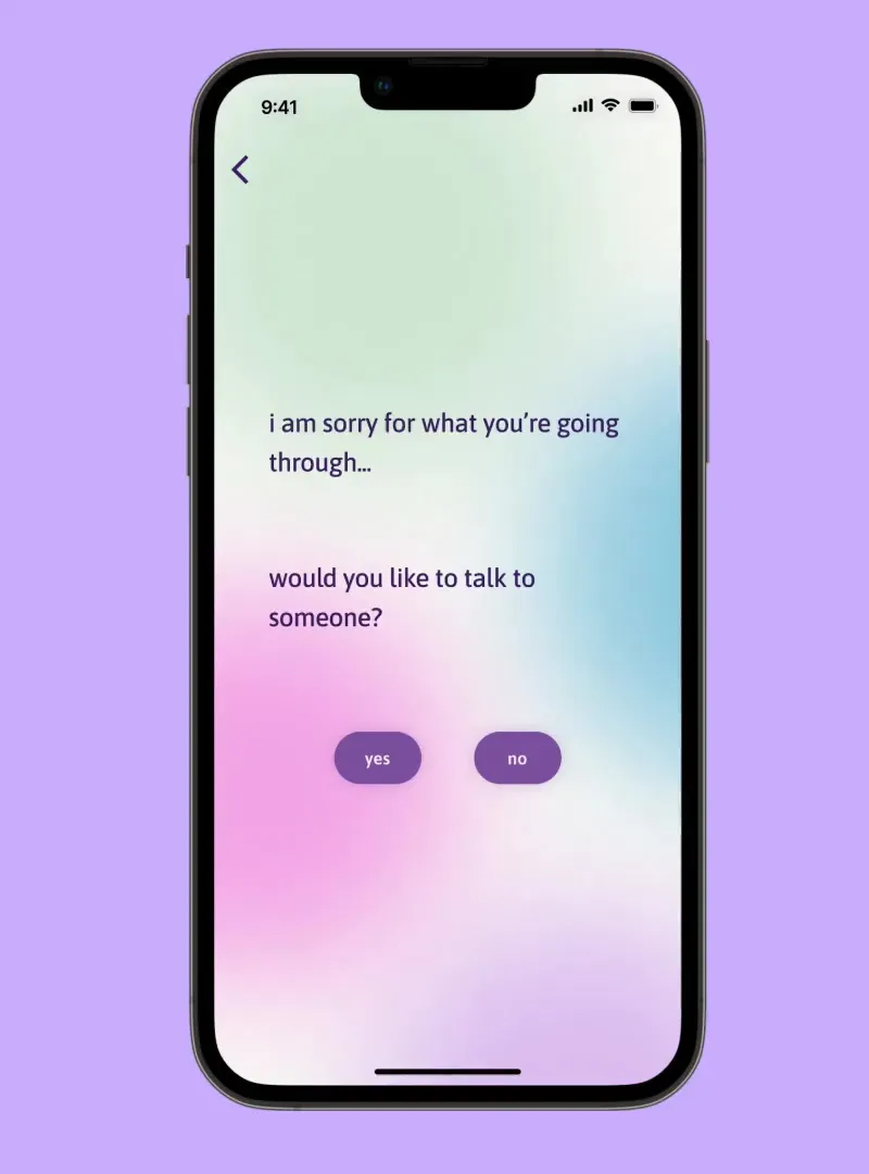
No — Path
Suppose the user chooses NO then there is a soft consoling and then the user is guided to the home page where they have access to various curated content.
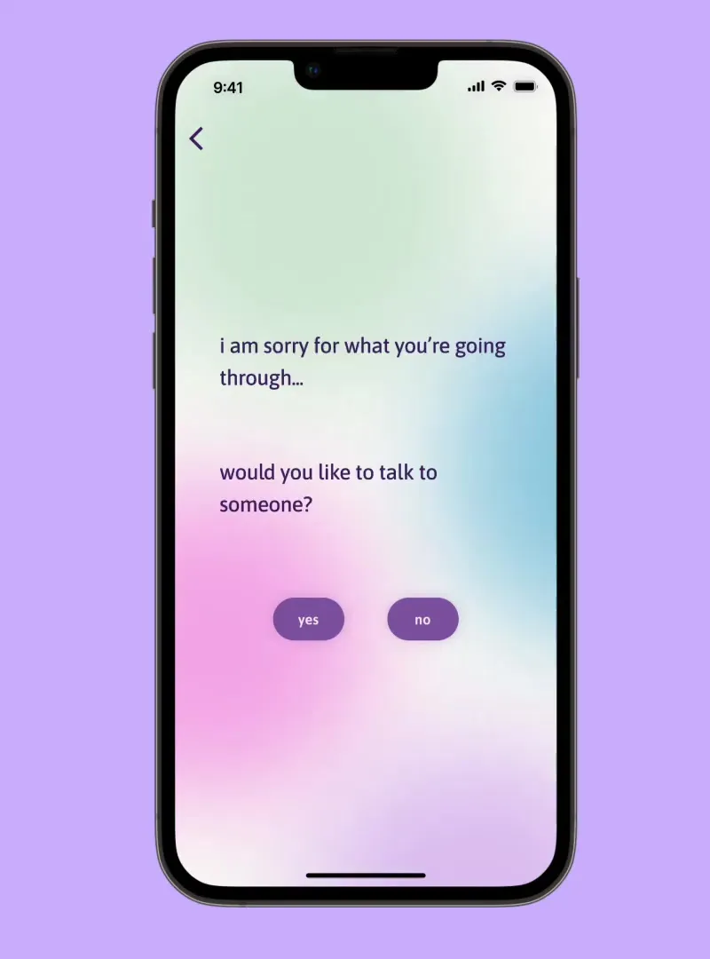
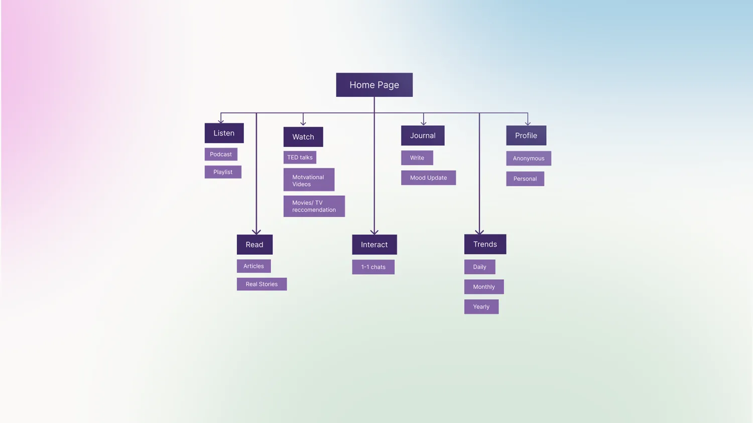
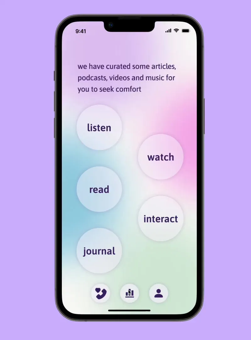
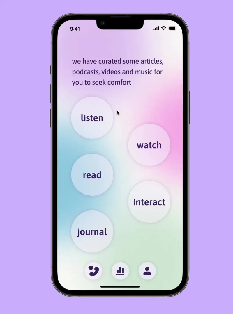
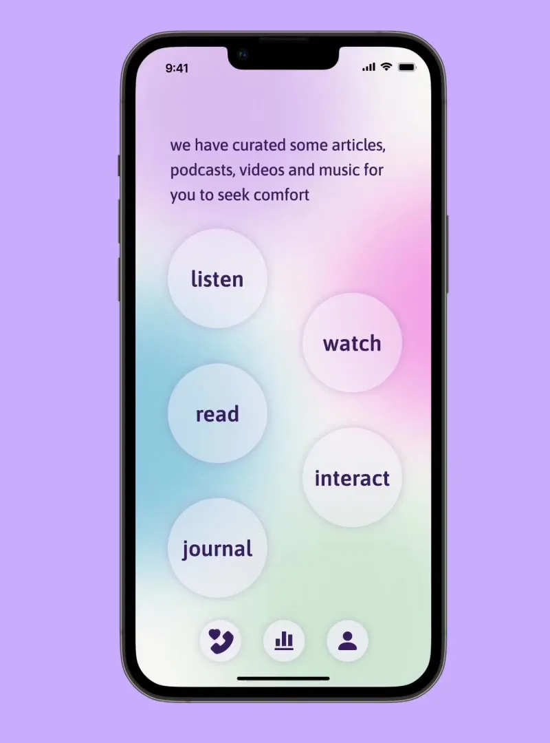
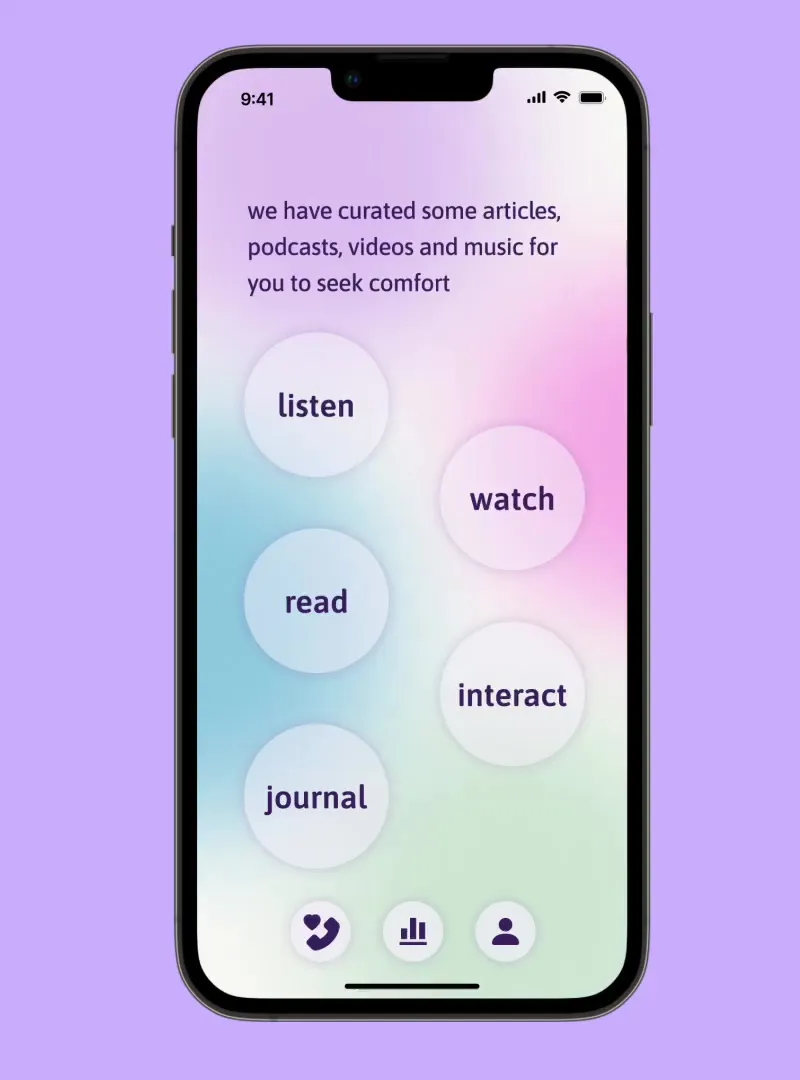

Home Page — Listen, Interact, Journal, Trends, Profile
Listen: Curated podcasts for the queer community, plus music playlists that they can share with their friends within the app. Interact: they are connected to anonymous people within the app who share the same interests; users can chat and build friendships if both parties choose to. Trends: the user can access all the activities they have performed within the app — tracking their steps, mood, journal and interactions.
Profile: Qwwweero allows the user to set 2 profile pages — Anonymous and Personal. The Anonymous profile shows only limited information, with a display photo selected from a set of 6 illustrations. The Personal profile lets the user share more information and link other social media. The primary profile is always Anonymous, but at any point users can share and limit access to their personal profile with each individual they interact with.
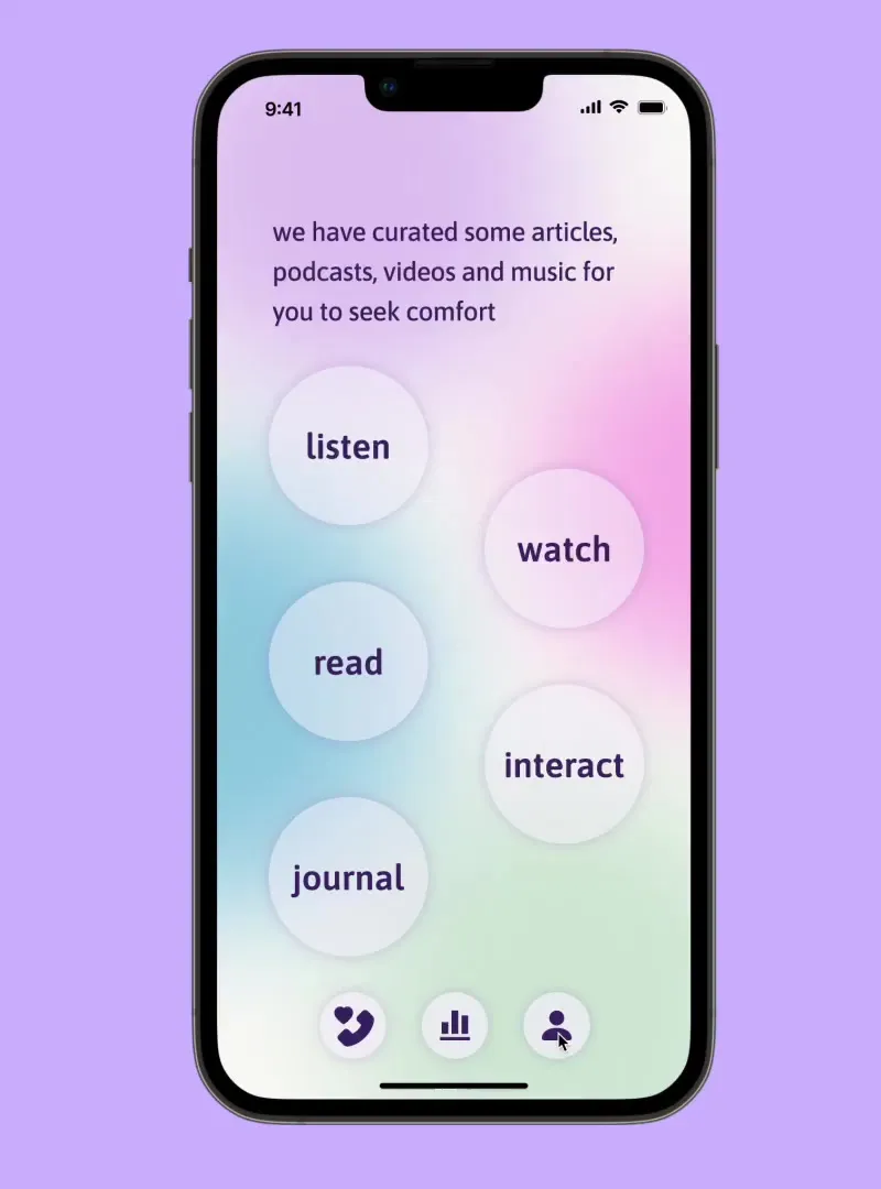
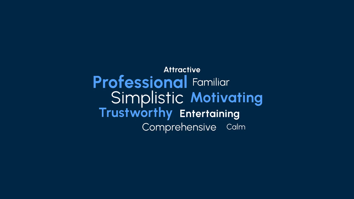
Desirability Testing
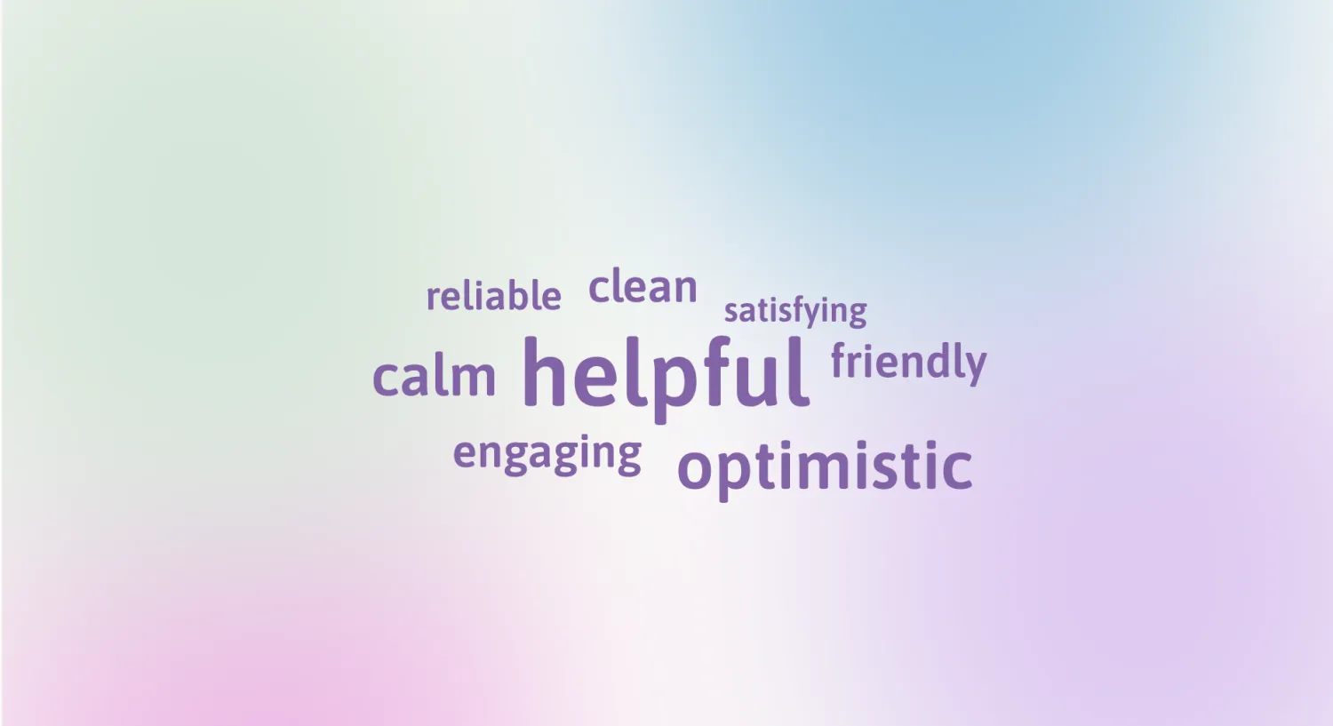
We first asked our users to test our prototype and voice out their thoughts. Once they completed the testing we asked them to send us 5 words from the Microsoft reaction card list.
38 pieces · 8 motion
Discord.
UI redesign — “Acid Drip”
The Brief
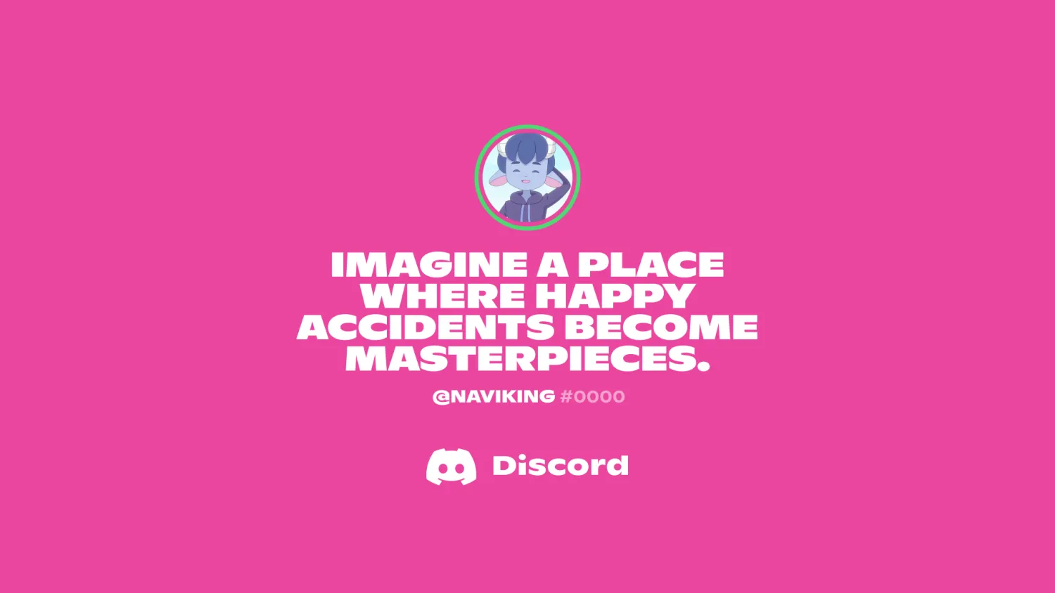
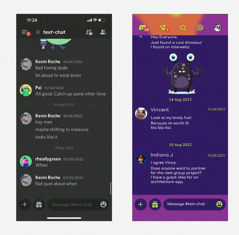
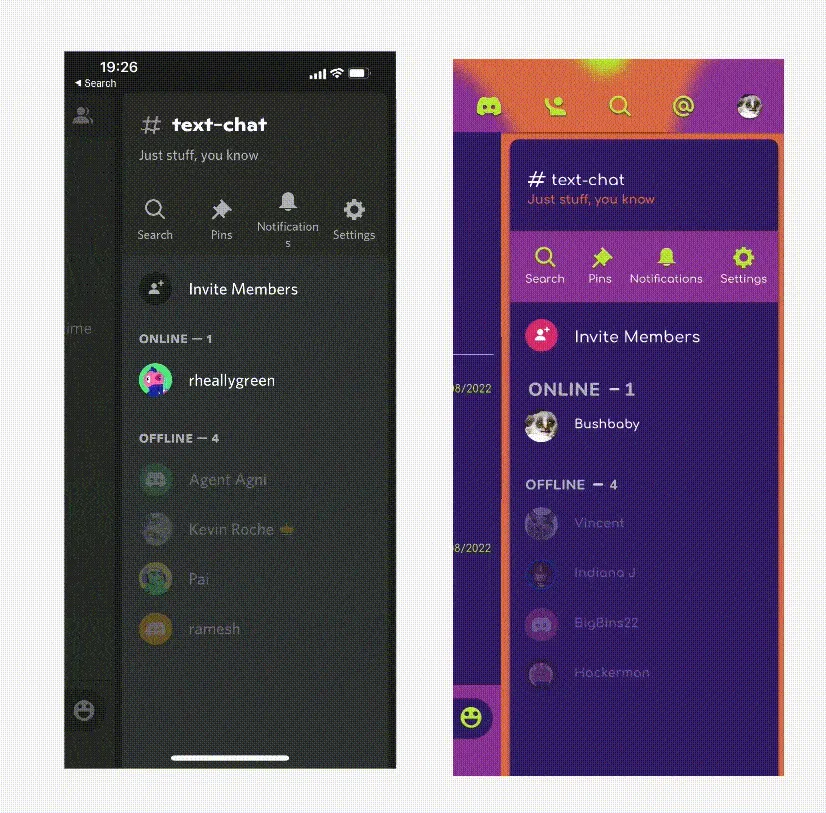
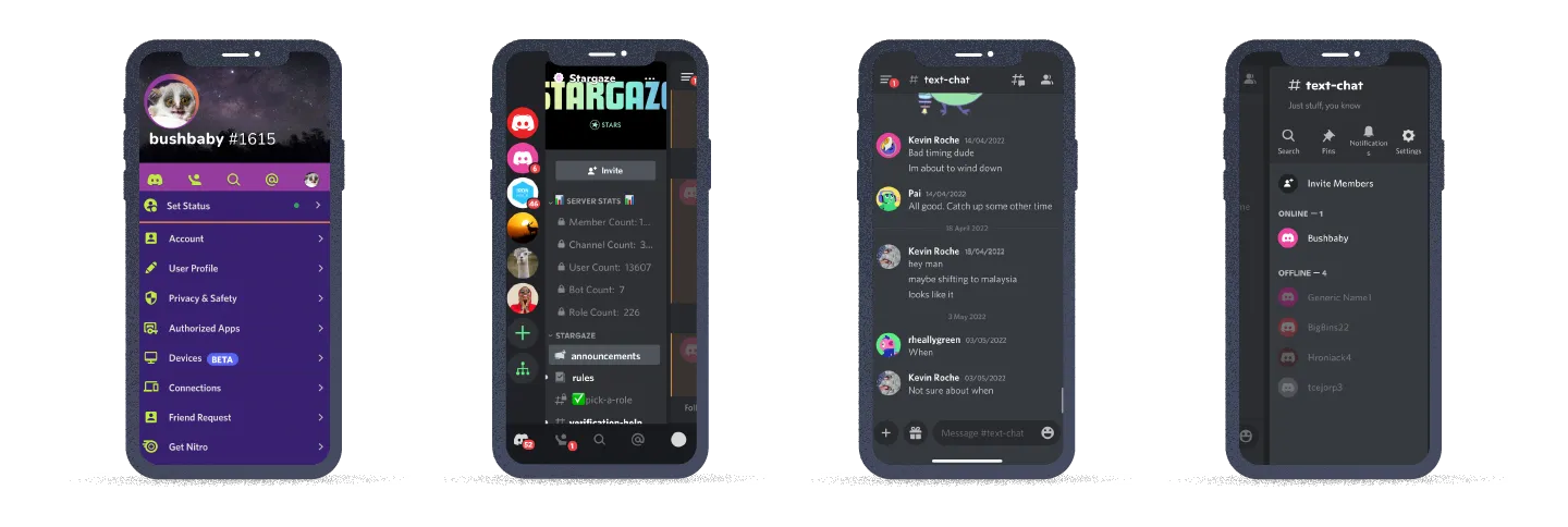
As part of the visual redesign, first, replicate/clone the existing screens. Second, redesign the app’s look and feel. It might be as simple as updating current components, as complex as redesigning entire screens, or as drastic as redefining the brand’s identity.
The Challenge
Redesigning the app should not deviate from the purpose and core values of the app — focusing only on the user interface.
Our App Choice
Discord is a VoIP and instant messaging social platform. It allows users to communicate through voice calls, video calls, text messaging, media and files in private chats or as part of communities called “servers”.
Ever since its launch in 2015, its users have rapidly grown — approximately 150 million active users each month! Establishing itself as one of the dominant players in the communication industry.
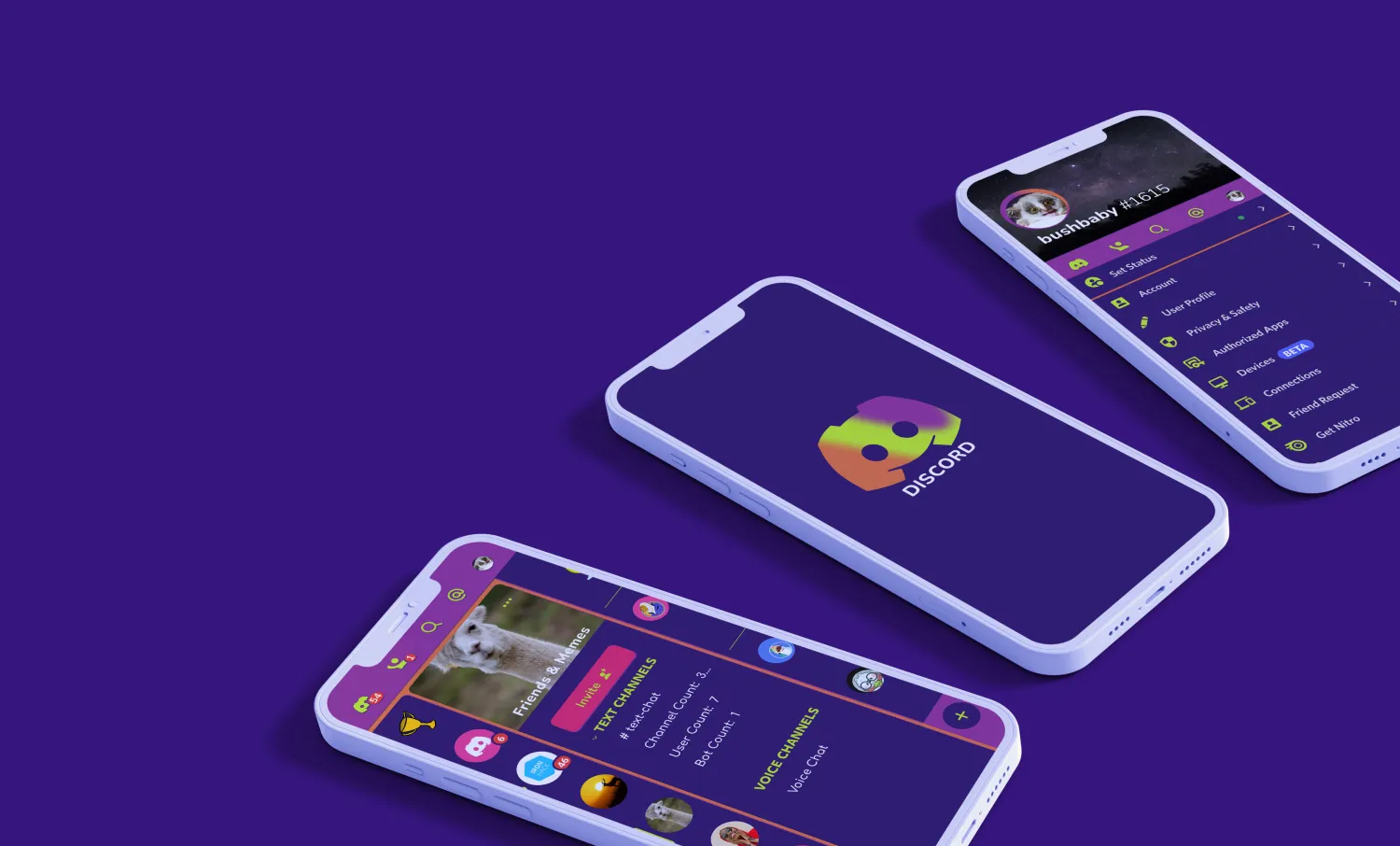
Heuristic Analysis
To be able to get into the nitty-gritty of the placements and alignments — basically the heuristics of the design — we began the tedious process of cloning! Cloning the app helped us with our heuristics, making us observe the app through the lens of atomic design; as we replicated we observed the inconsistencies.
Comparative Analysis
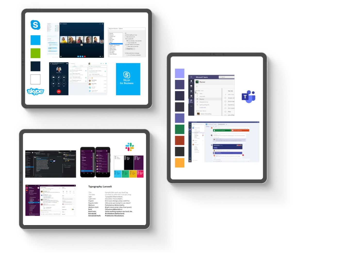
There is no other like Discord, but here, for our visual competitor analysis, we looked into Slack, Skype and Microsoft Teams. Slack has a refined palette, keeping to core colours throughout its dark and light modes. Next, we looked at good old Skype, which shared certain values of Discord but is simple, professional, clean and pretty basic. Lastly, we analysed MS Teams — pretty similar to Skype: professional, clean, colourful, straightforward.
Mood-board
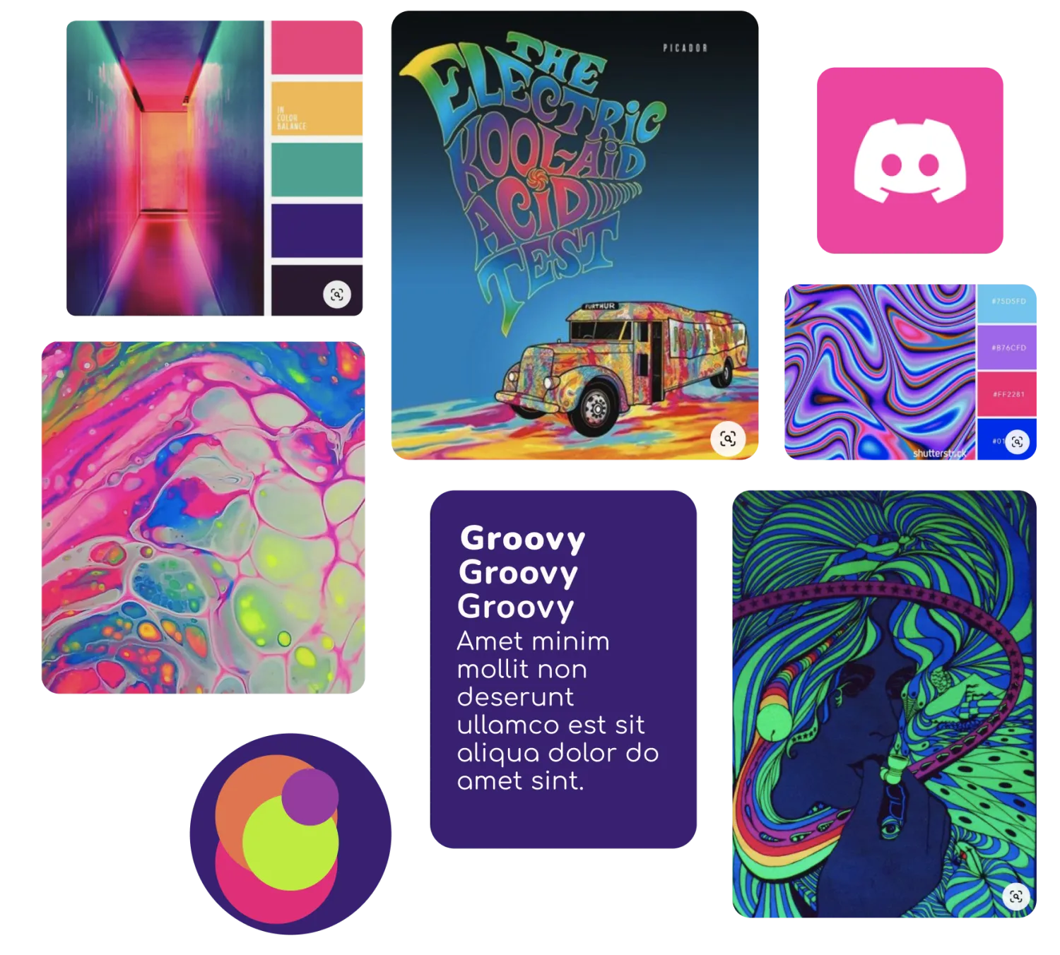
When thinking of Discord the few words that popped into our head instantly were: connected, knowledge sharing, community. We also wanted to remain slightly connected to the original Discord identity of it being colourful and fun. Since this project required us to think out of the box and allowed us the freedom to pick the theme of our choice, we went for an Acid Drip look for the UI. — Fun, Vibrant, Welcoming, Connected.
User Interface
Typography
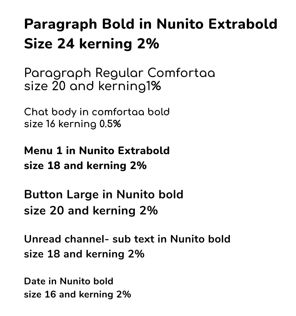
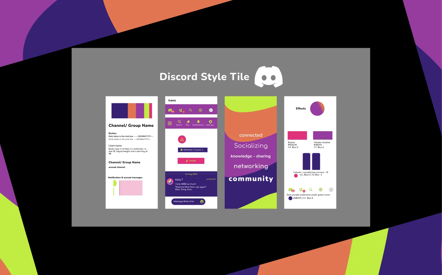
Discord originally uses ABC Ginto and Whitney. For our theme, we chose Comfortaa for the body and Nunito for the headings. Both these fonts are quite rounded, and since we were going towards the acid theme we didn't want the font to have any sharp edges.
Colour Palette
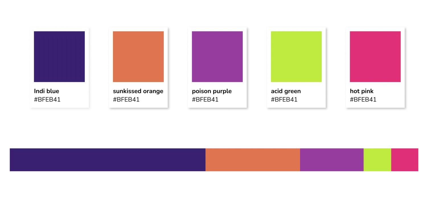
Maintaining loyalty to purple (similar to the OG), our primary colour is indigo blue, with secondary sun-kissed orange and poison purple, and accents of acid green and hot pink.
Style Tile
Style tiles are a visual reference to the design language of a website or app. They help tell a story through fonts, colour and style collections.
High-Fidelity Wireframe
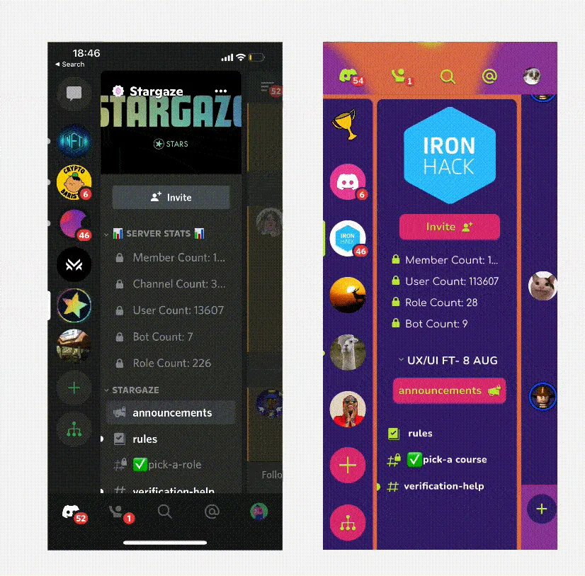
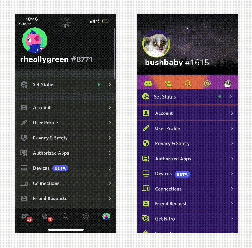
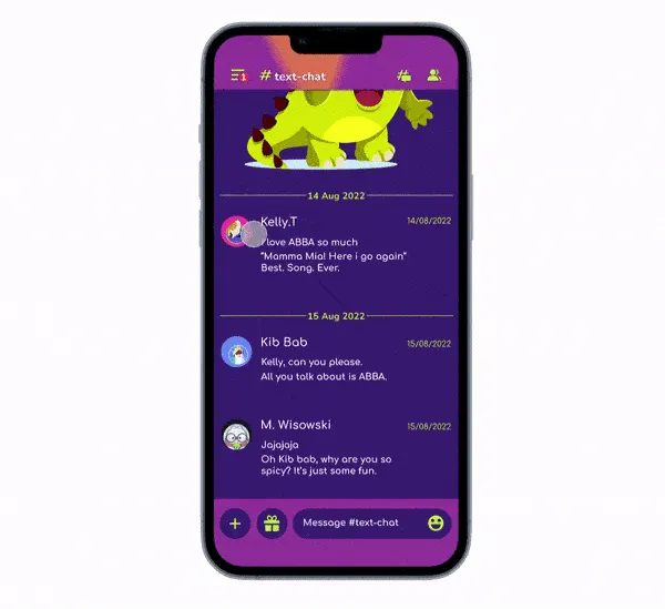
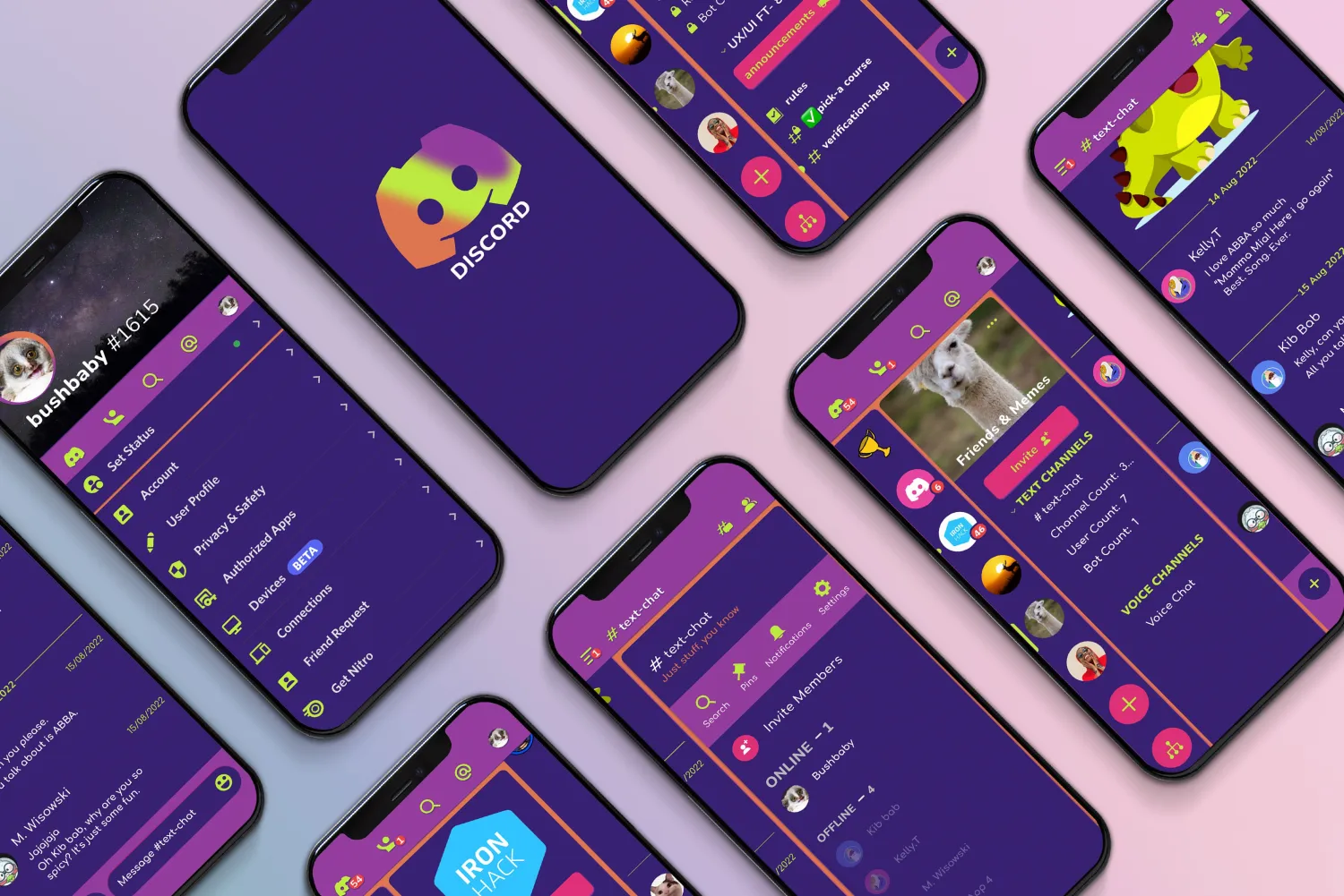
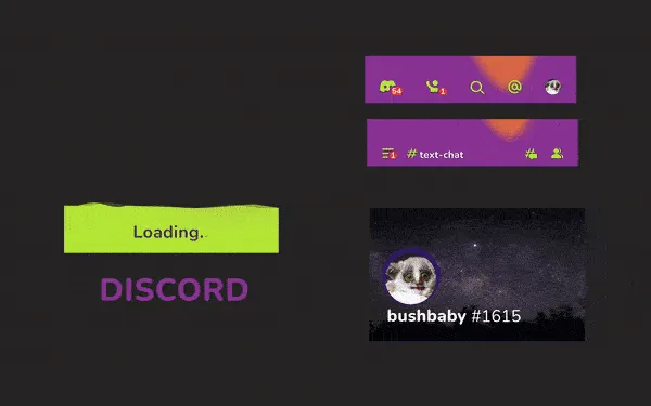
Redesigning the app by making one consistent header throughout and removing the footer. For the overall app, we decided to separate the page into columns. Remembering from our competitor analysis that there is truly no other app like Discord, we did not want to take away how it works — because it's pretty cool!
We focused on a better user flow between the pages. Having an orange base with indigo columns sliding across gives the three pages a feel of being part of one big section.
17 pieces · 1 motion
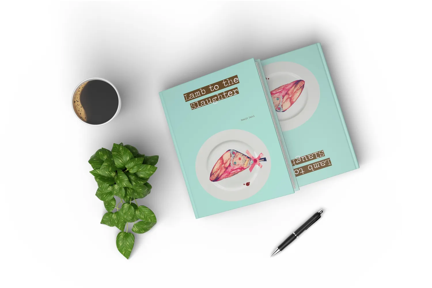
Lamb to the Slaughter.
Illustration
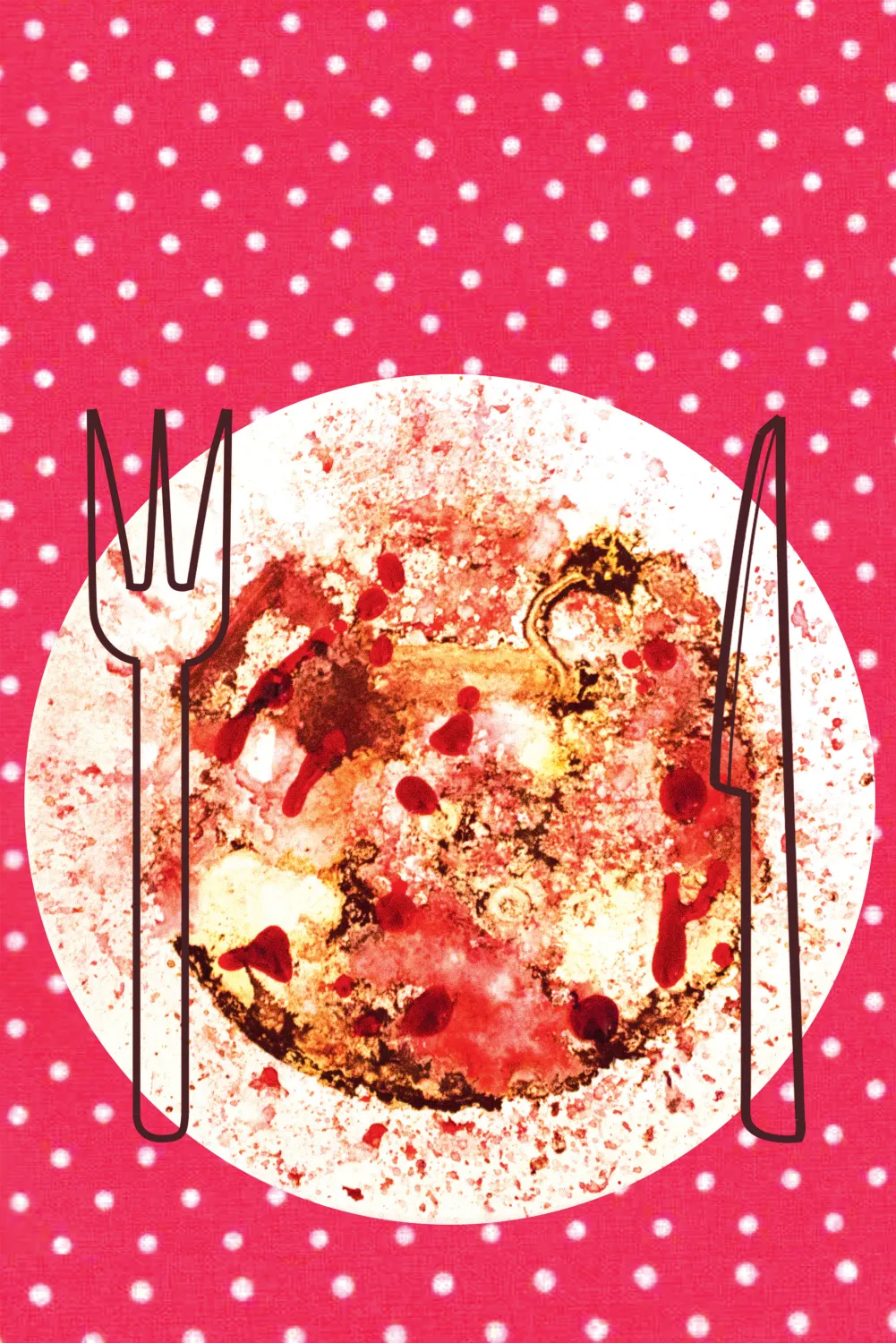
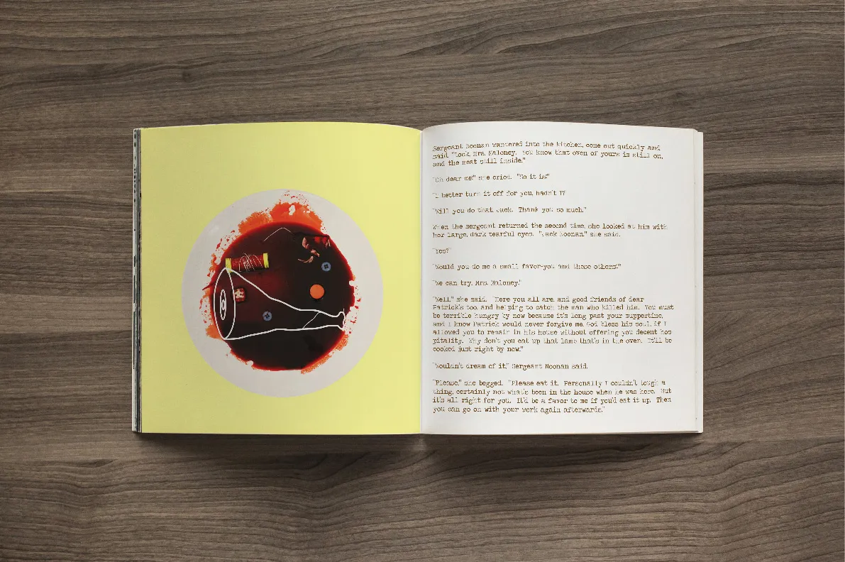
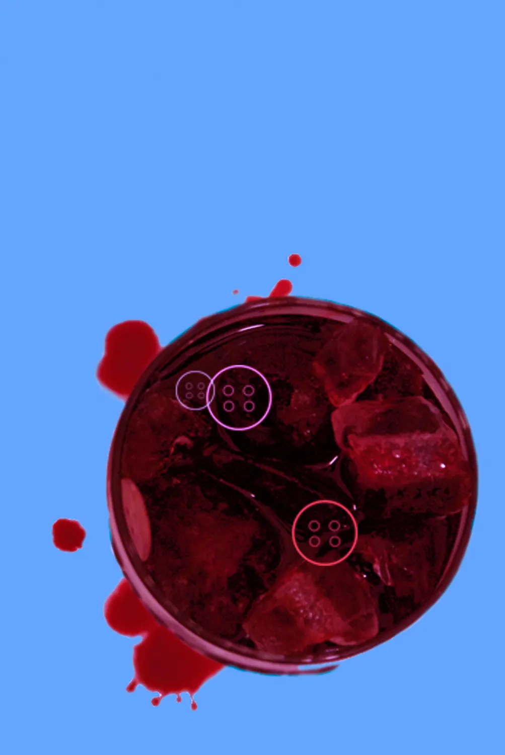
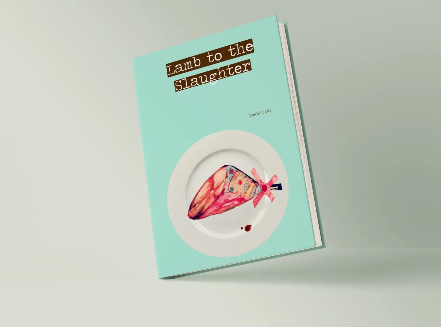
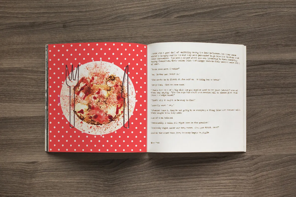
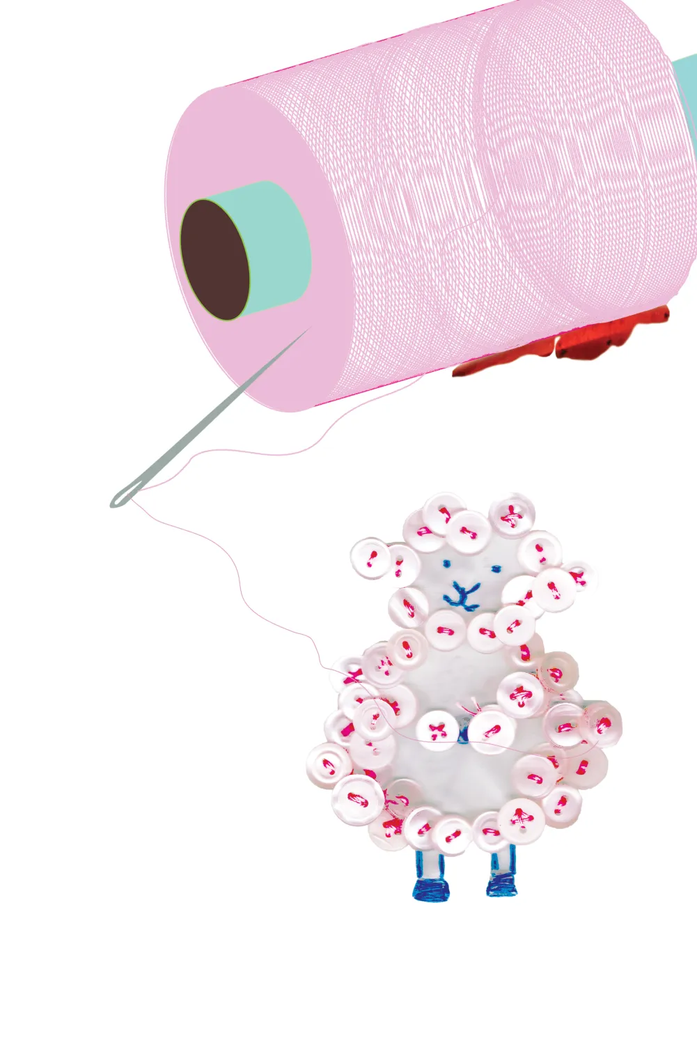
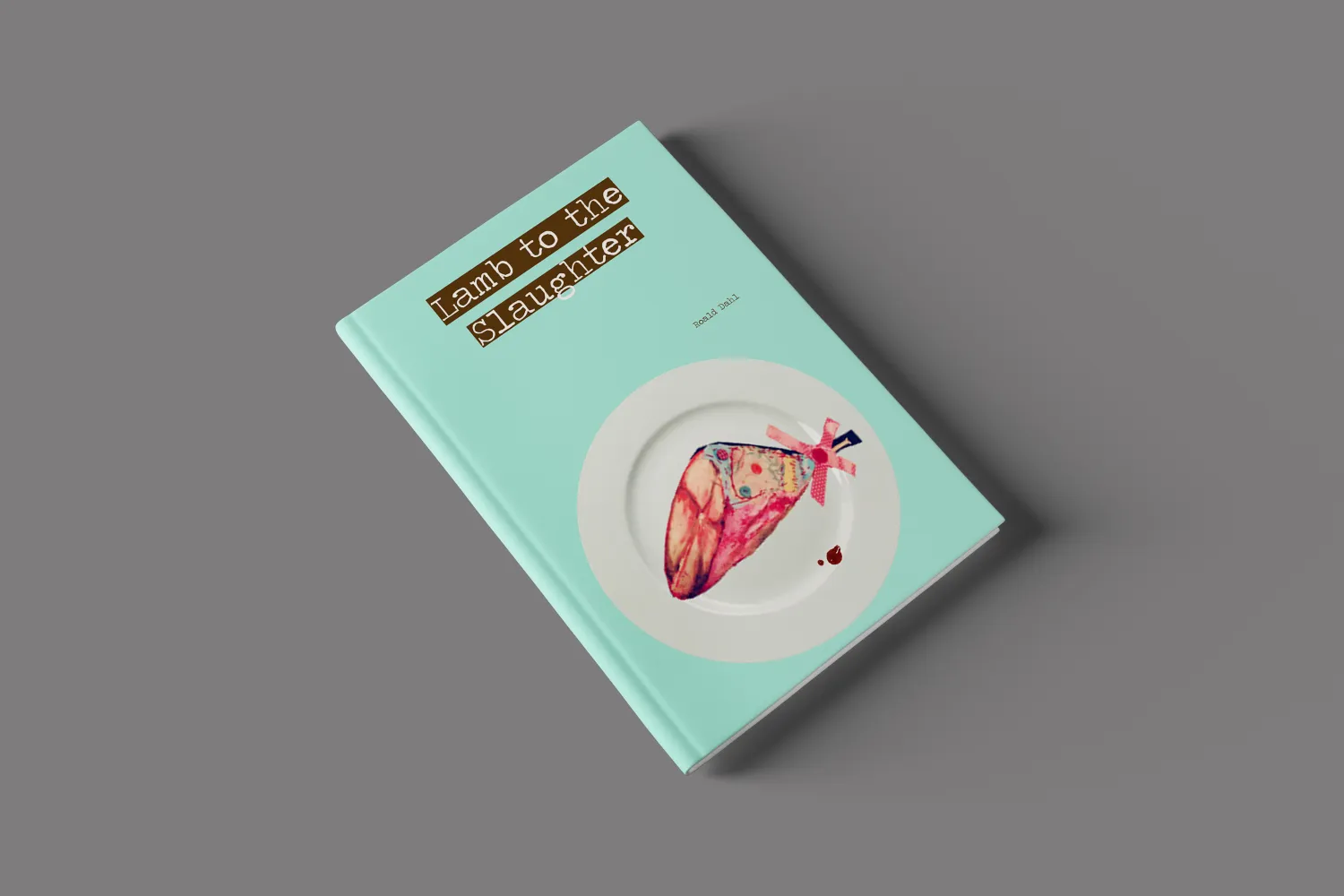
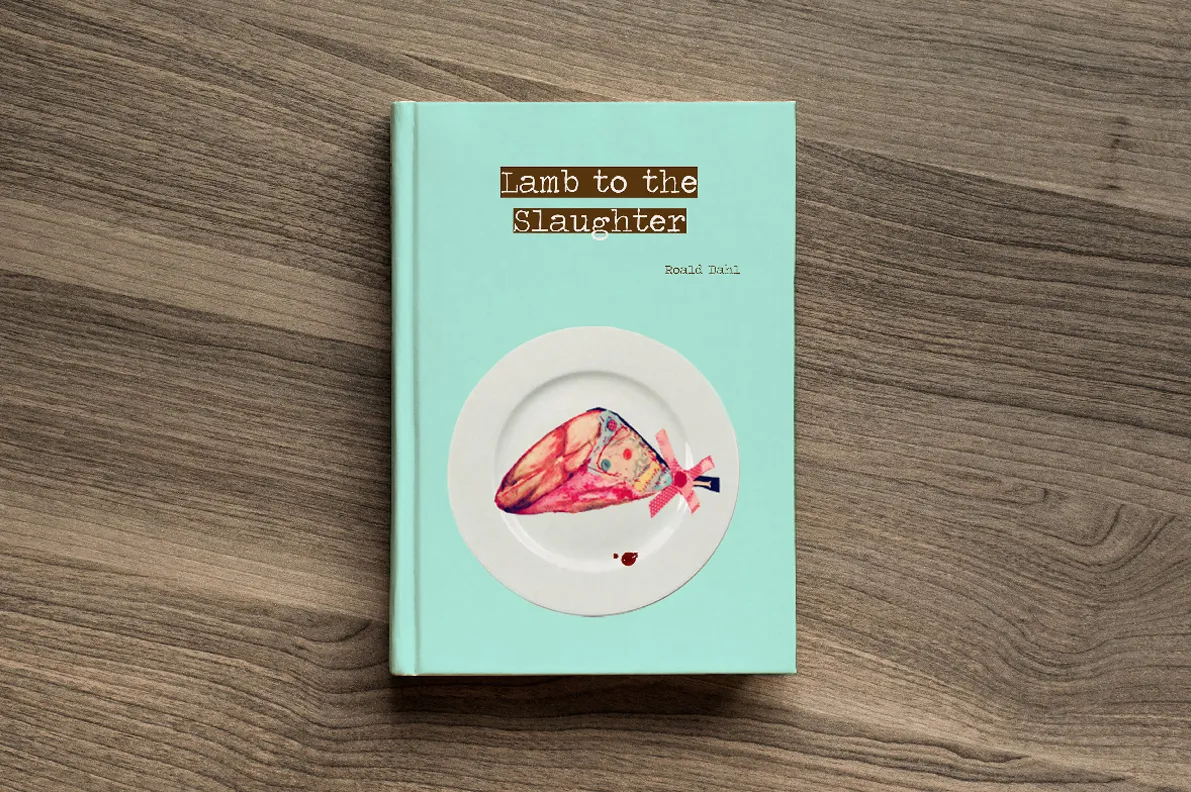
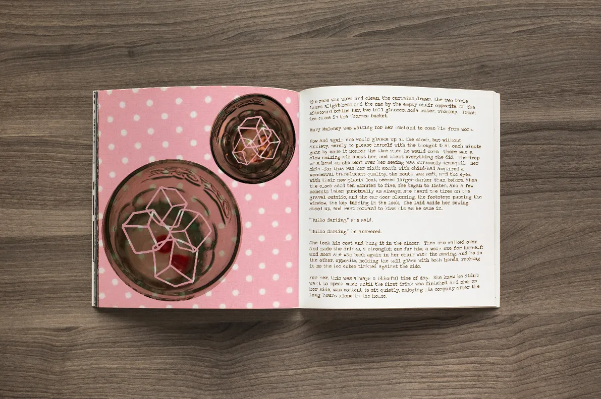
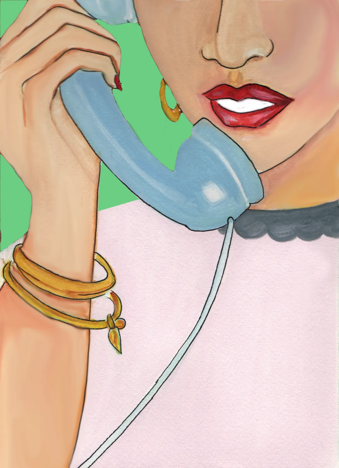
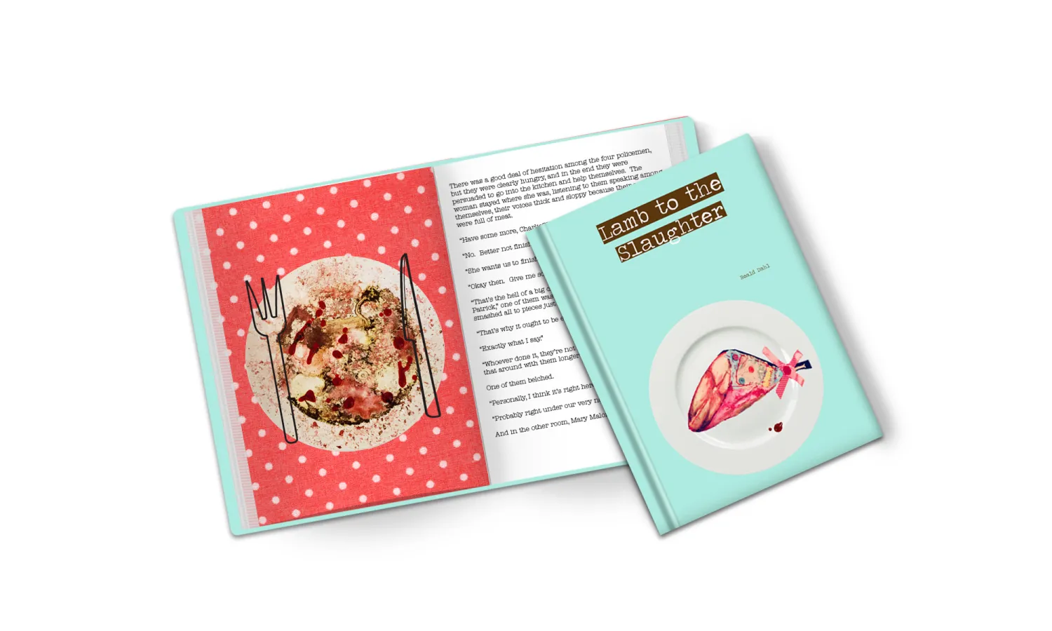
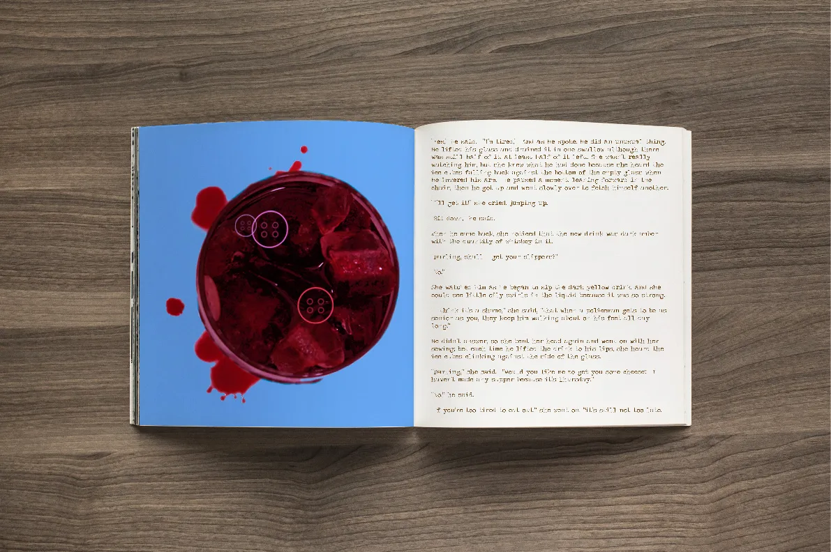
Lamb to the Slaughter is a short story written by Roald Dahl. The story is slightly dark, and the brief was to illustrate it for people above the age of 18. For this project I experimented with mixed media — vector drawings, photography and stitching — and used a retro colour palette for the book cover and the 4 inside illustrations.
13 pieces